GR Project 175 Beer Label Competition
Kendall College of Art & Design / City of Grand Rapids
Kendall College of Art & Design / City of Grand Rapids
This project was created for the GR Project 175 Beer Label Competition to design a commemorative can label celebrating 175 years of growth in Grand Rapids, Michigan, intended for local print production and distribution.
BRIEF SNAPSHOT
Client:
Kendall College of Art & Design / GR Project 175
Client:
Kendall College of Art & Design / GR Project 175
Objective:
Design a beer can label representing the identity, culture, and growth of Grand Rapids in celebration of the city’s 175th anniversary.
Design a beer can label representing the identity, culture, and growth of Grand Rapids in celebration of the city’s 175th anniversary.
Audience:
Local residents, community members, and consumers engaging with a limited-edition commemorative product distributed throughout Grand Rapids.
Local residents, community members, and consumers engaging with a limited-edition commemorative product distributed throughout Grand Rapids.
Constraints:
• Can label format and print specifications
• Clear visual readability at small scale
• Strong local relevance and storytelling
• Competitive academic submission environment
• Real-world production and distribution considerations
MY ROLE & OWNERSHIP
I was responsible for:
I was responsible for:
• Developing two fully realized label concepts from initial ideation to final digital artwork.
• Creating production-ready mockups for competition submission.
• Designing final print-ready files aligned with can label specifications.
• Preparing artwork for potential real-world printing and distribution.
STRATEGIC THINKING
The design approach focused on visually capturing Grand Rapids’ identity through two distinct but complementary narratives: ecological heritage and river-driven movement.
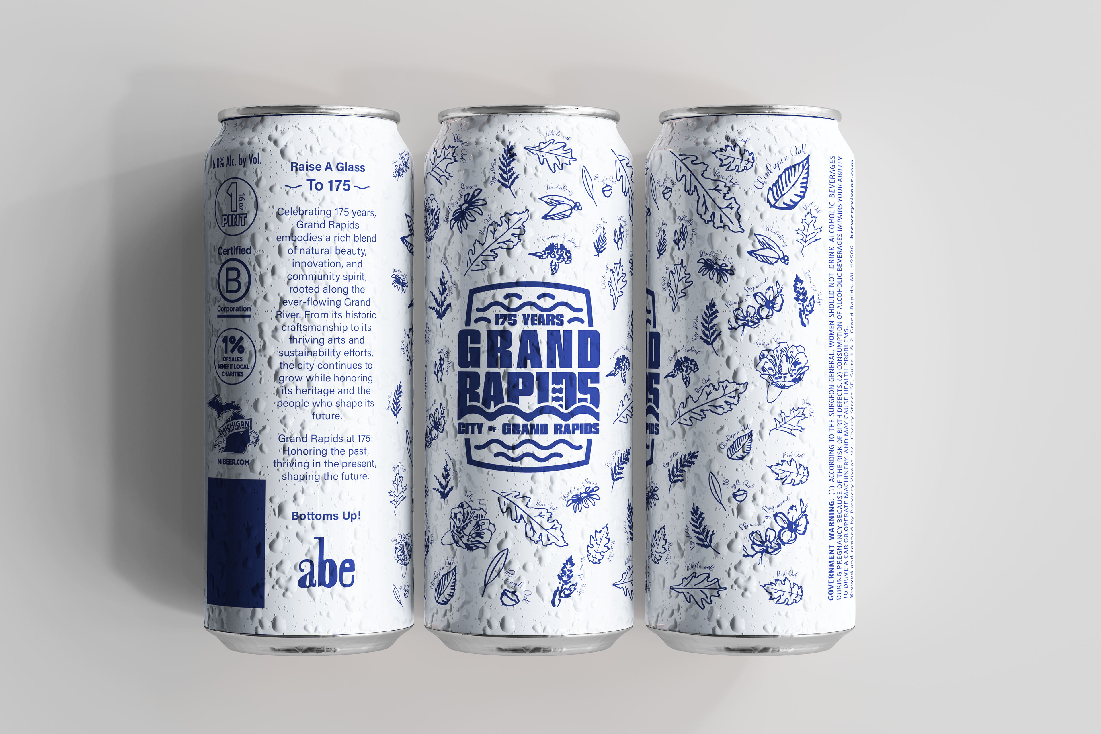
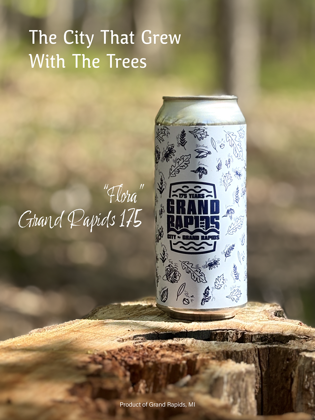
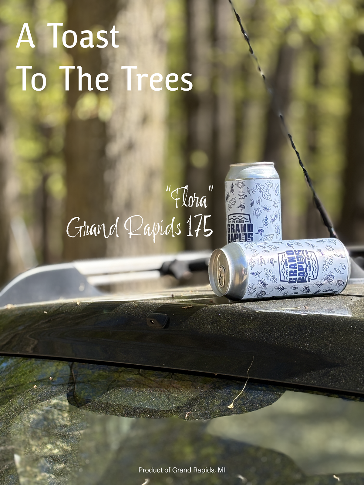
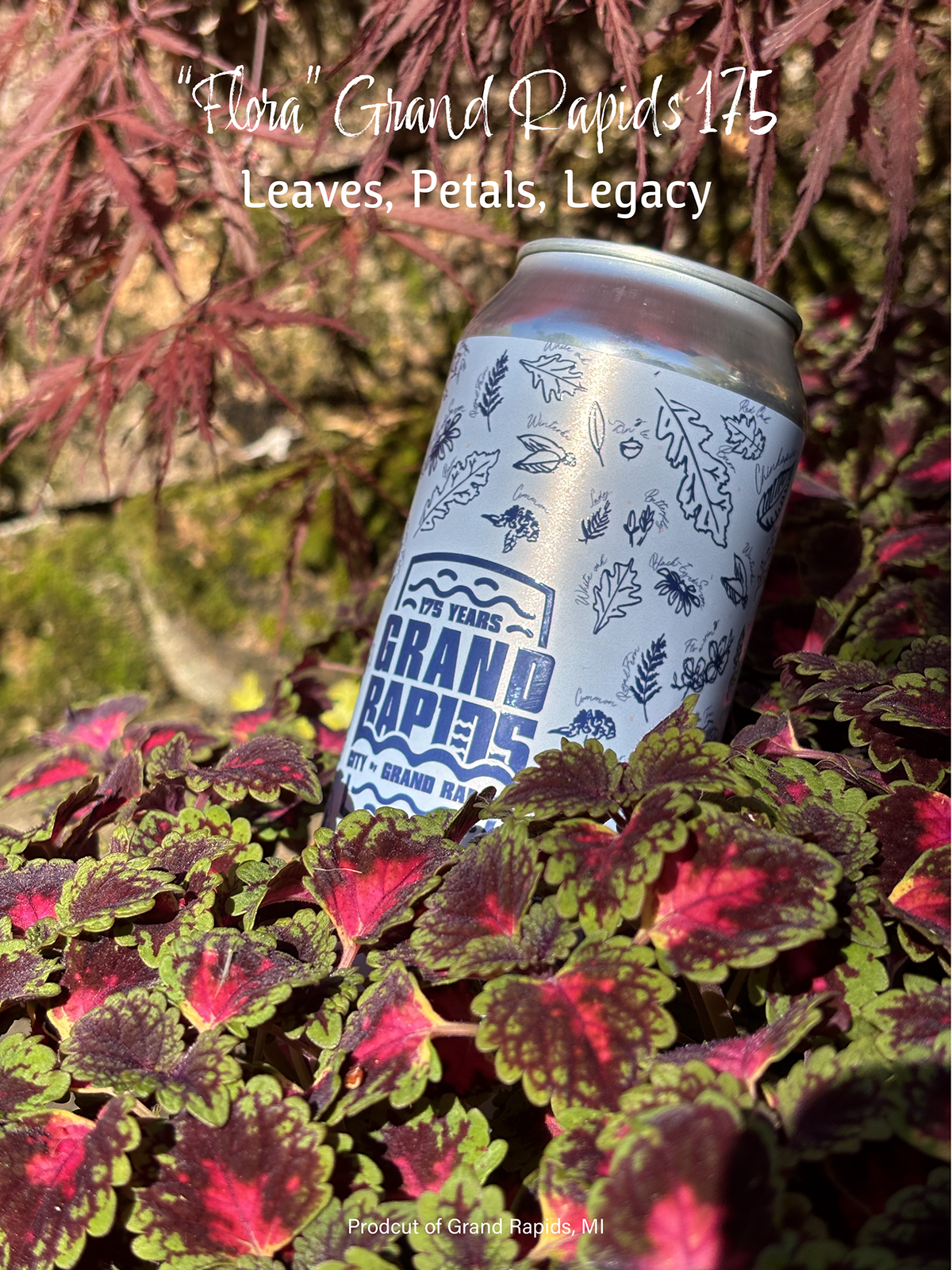
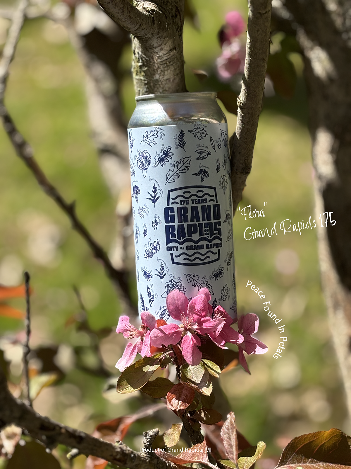
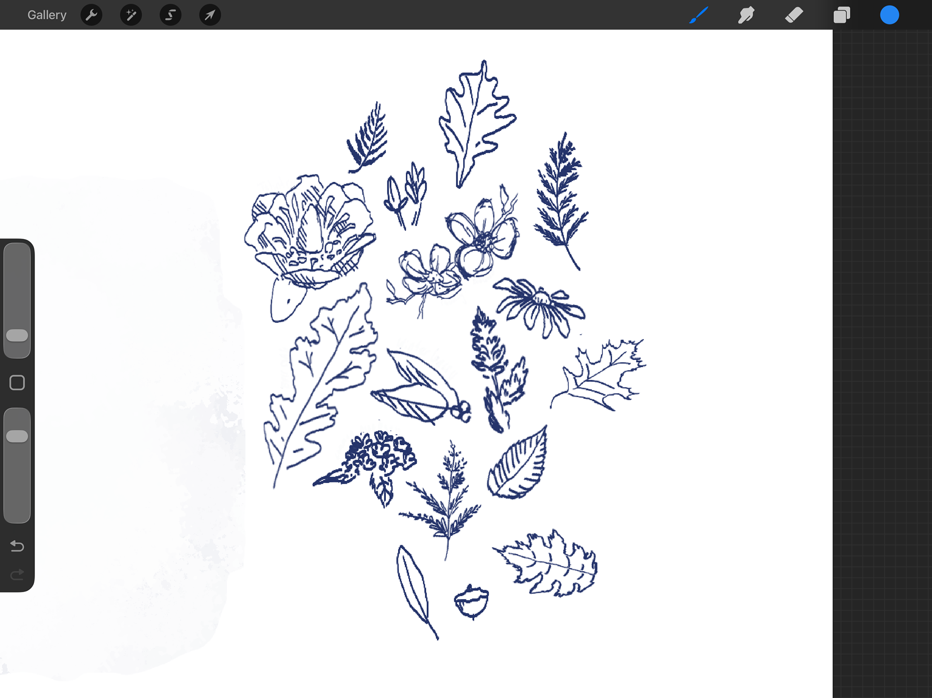
“Flora” emphasized the city’s deep-rooted natural beauty, using intricate botanical illustration and a calm blue palette to reflect growth, longevity, and connection to the land.
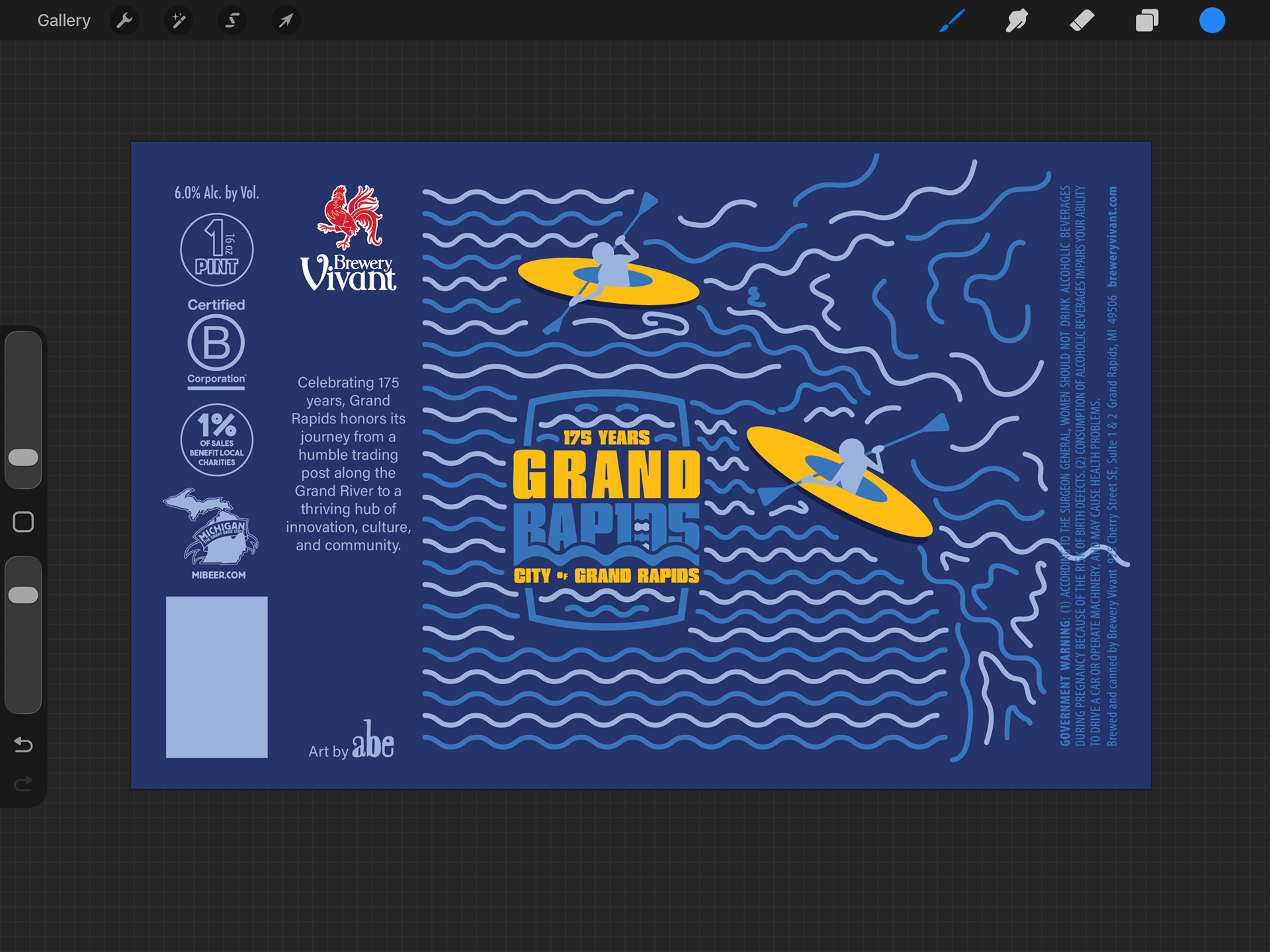
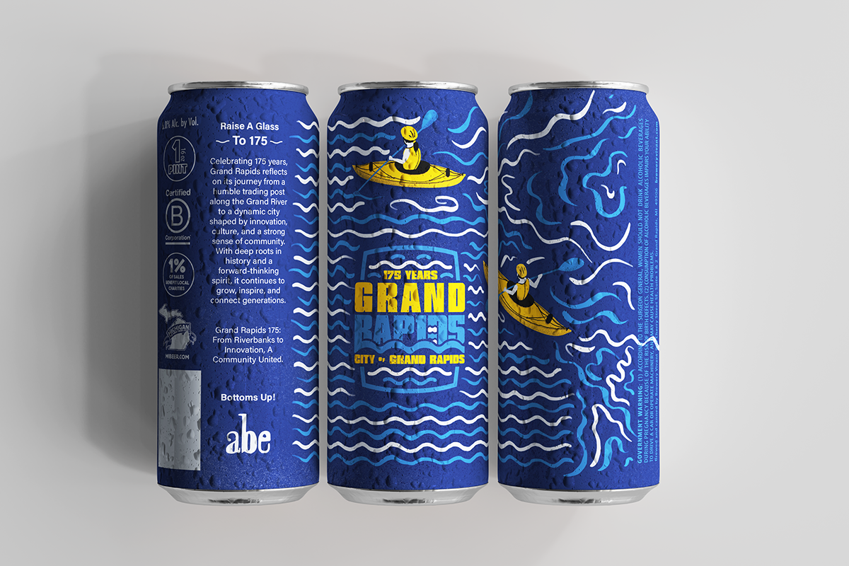
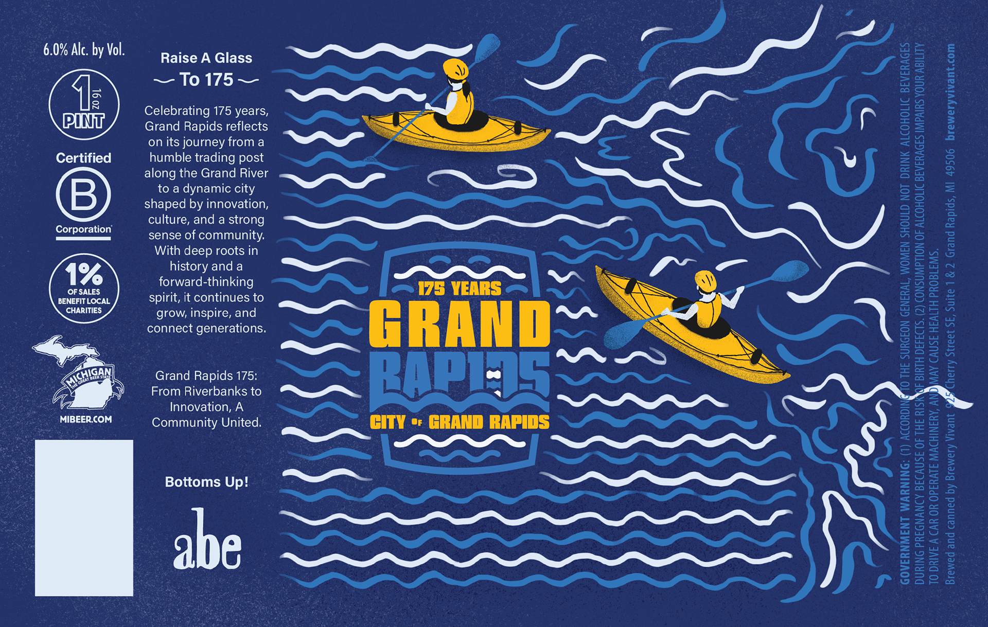
“Waves” highlighted the Grand River as a symbol of motion and evolution, using bold fluid forms and vibrant kayaker accents to represent energy, adventure, and forward momentum.
This ensured each concept communicated civic pride while remaining visually impactful and legible within the constraints of a small-format printed label.
SYSTEM / EXECUTION CONTEXT
Each label was designed as a complete visual system, balancing illustration, typography, and color hierarchy to ensure clarity at scale.
The final artwork was structured to translate seamlessly from digital mockups to print production, maintaining detail integrity and contrast across curved can surfaces.
FULL-FUNNEL APPLICATION
• The work was applied across multiple touchpoints, including:
• Competition submission materials
• High-resolution digital artwork
• Realistic product mockups
• Print-ready label files
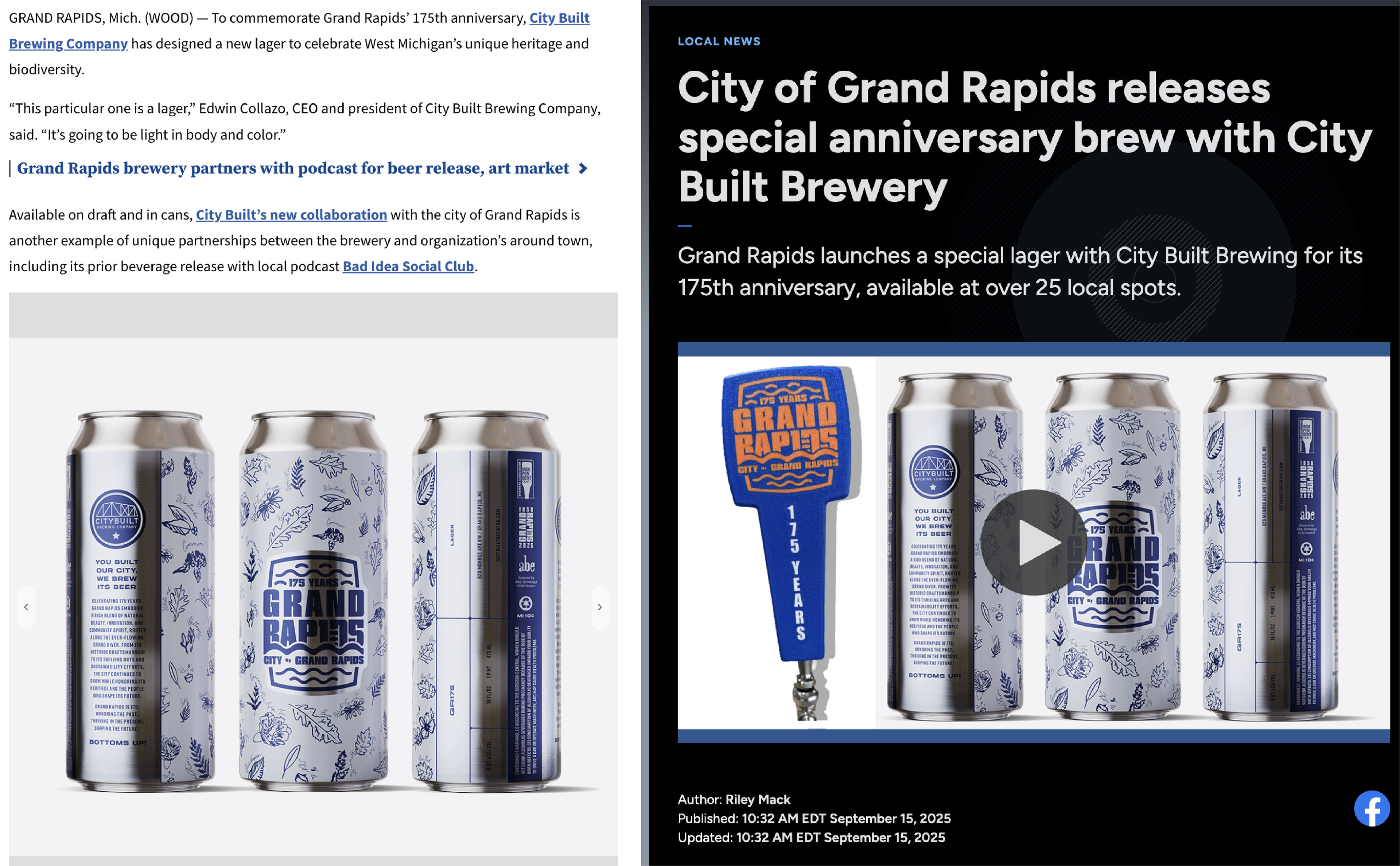
• Local press and media coverage
PRODUCTION & REAL-WORLD CONSIDERATIONS
Files were prepared with can label print specifications in mind, ensuring accurate color reproduction, detail clarity, and layout integrity on curved aluminum surfaces.
The selected design was ultimately printed and distributed locally, requiring production-ready precision beyond competition submission standards.
IMPACT & OUTCOME
The “Flora” concept originally earned second place in the competition and, due to unforeseen circumstances, it was ultimately selected for official print and local distribution as the winner. The project gained regional media coverage and community visibility, reinforcing the design’s resonance with both judges and the public while demonstrating the ability to translate conceptual illustration into real-world production.