Nashville: Savor The Sound
Kendall College of Art & Design
Kendall College of Art & Design
This academic campaign project explored how Nashville’s identity could be expressed through a cohesive advertising system combining its iconic hot chicken culture with its dynamic music scene across multiple promotional formats.
BRIEF SNAPSHOT
Client:
Kendall College of Art & Design (Academic Project)
Client:
Kendall College of Art & Design (Academic Project)
Objective:
Develop a multi-format advertising campaign that visually unifies two defining elements of Nashville — its food culture and music heritage — into a scalable, cohesive brand system.
Develop a multi-format advertising campaign that visually unifies two defining elements of Nashville — its food culture and music heritage — into a scalable, cohesive brand system.
Audience:
Tourists, young professionals, and culturally engaged consumers drawn to Nashville’s food and entertainment scene.
Tourists, young professionals, and culturally engaged consumers drawn to Nashville’s food and entertainment scene.
Constraints:
• Create a cohesive visual system adaptable across multiple formats
• Maintain legibility across small-scale and large-format applications
• Develop original illustration assets to anchor the campaign identity
MY ROLE & OWNERSHIP
I was responsible for:
I was responsible for:
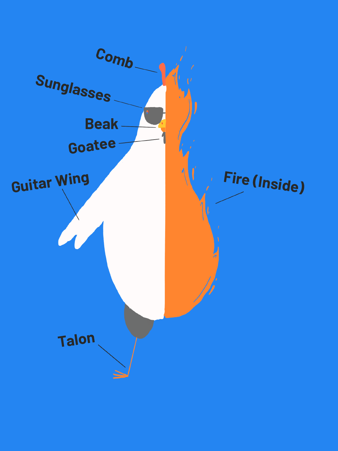
• Developing the campaign concept and visual direction.
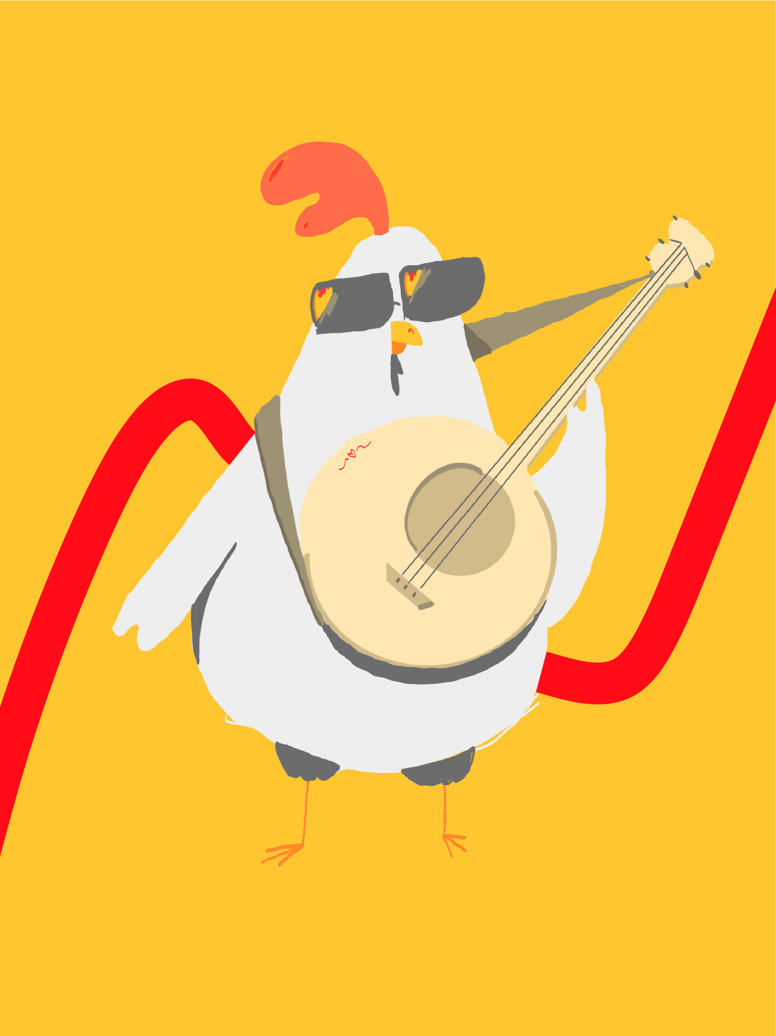
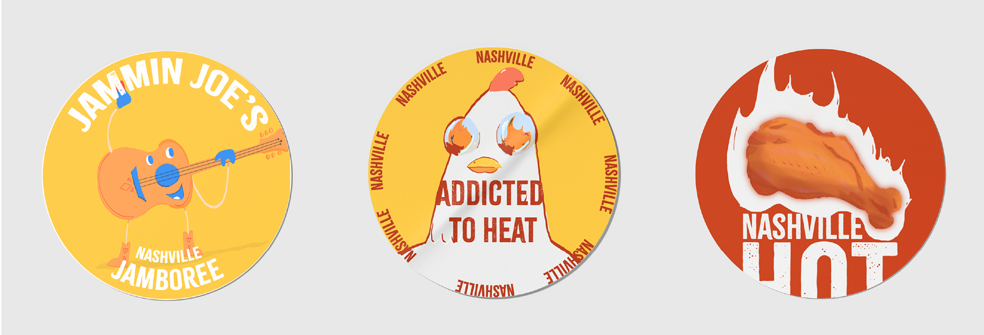
• Creating original illustration assets reflecting Nashville’s food and music culture.
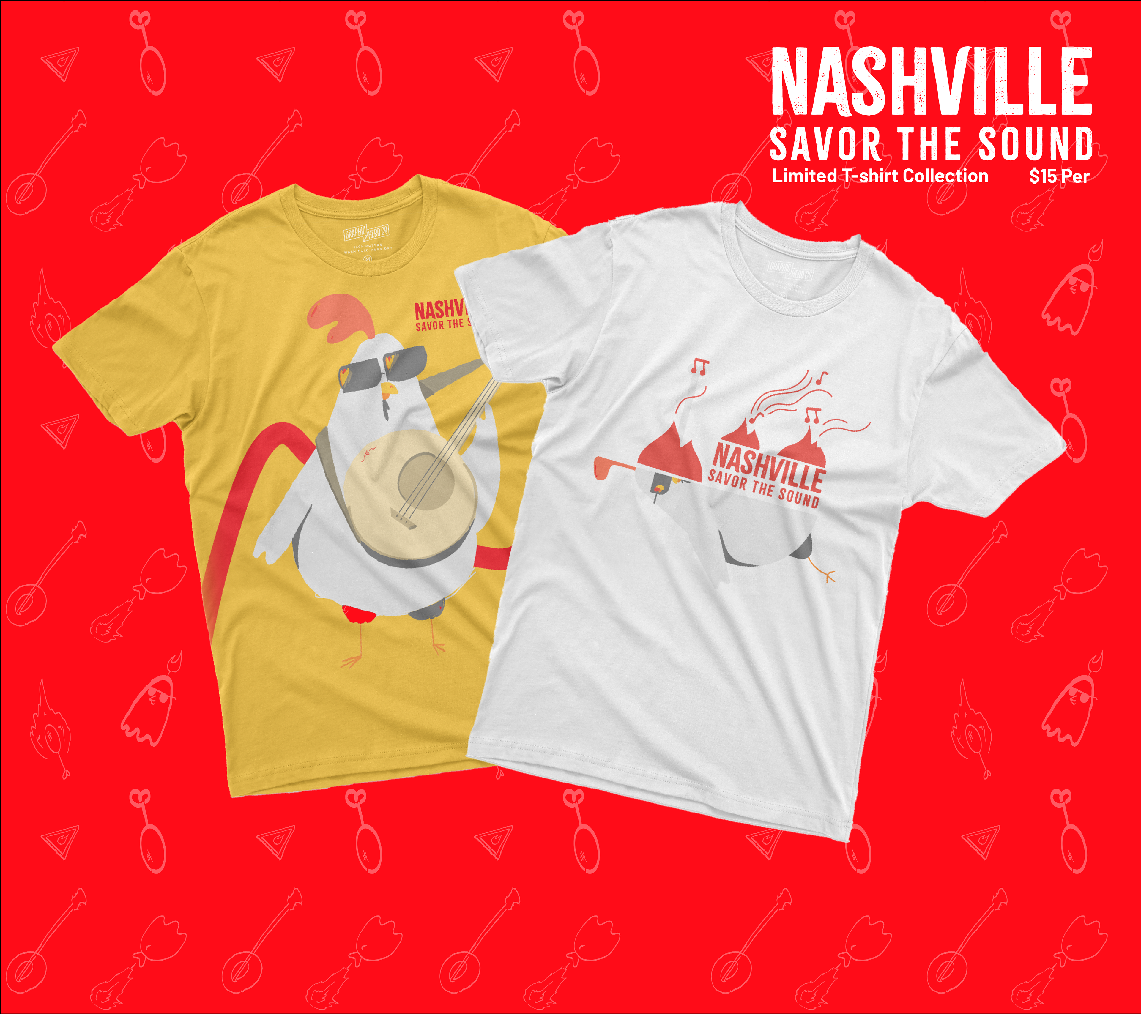
• Designing packaging, apparel graphics, print ads, and environmental concepts.
• Adapting visuals across digital and physical promotional applications.
STRATEGIC THINKING
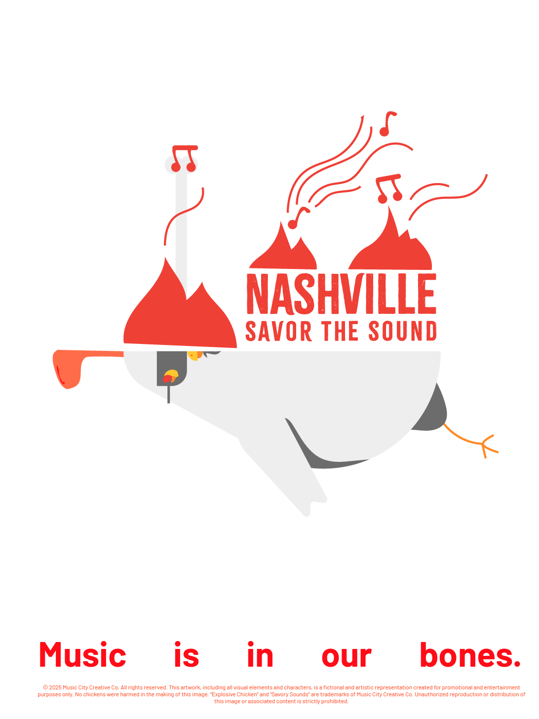
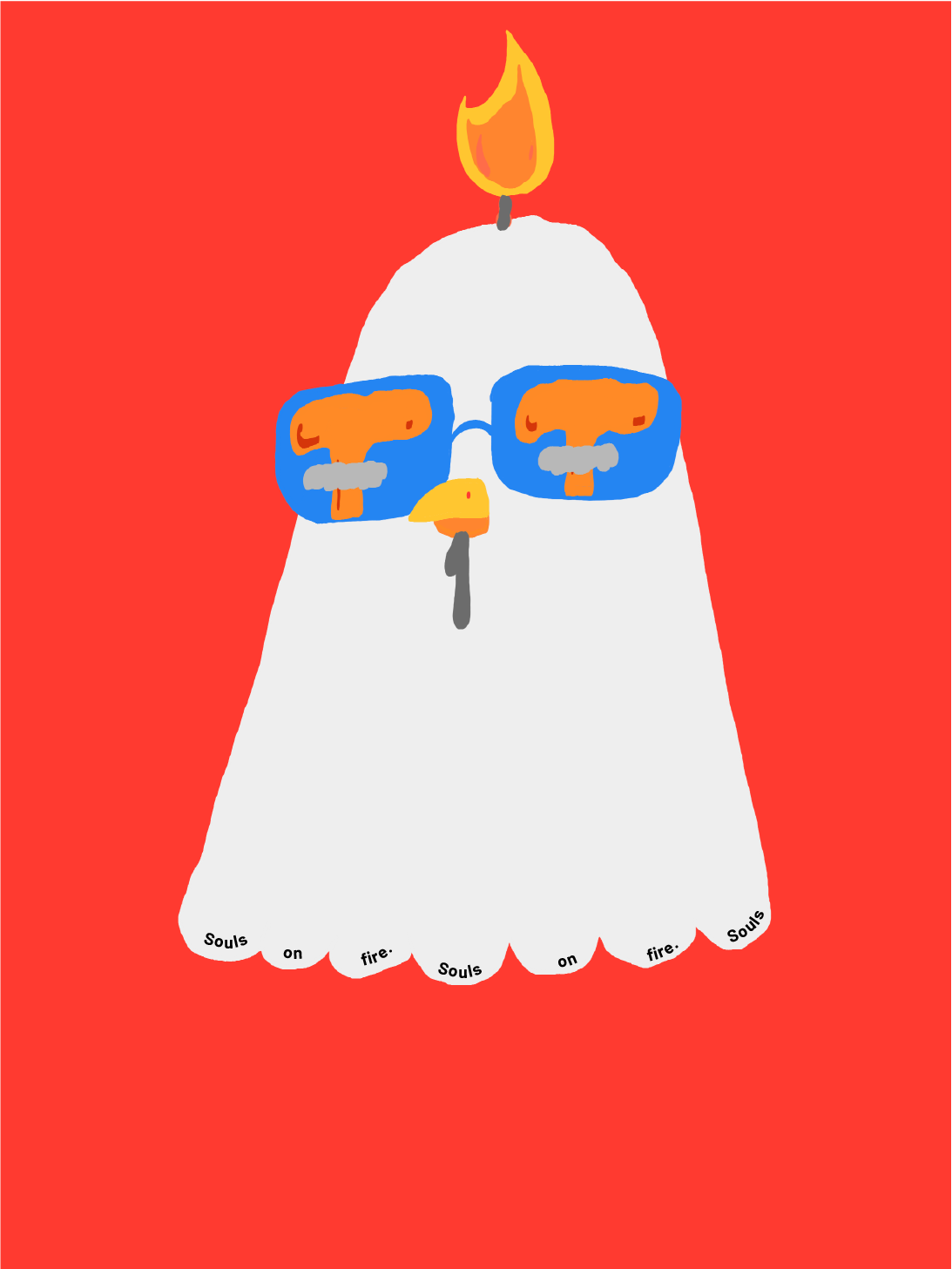
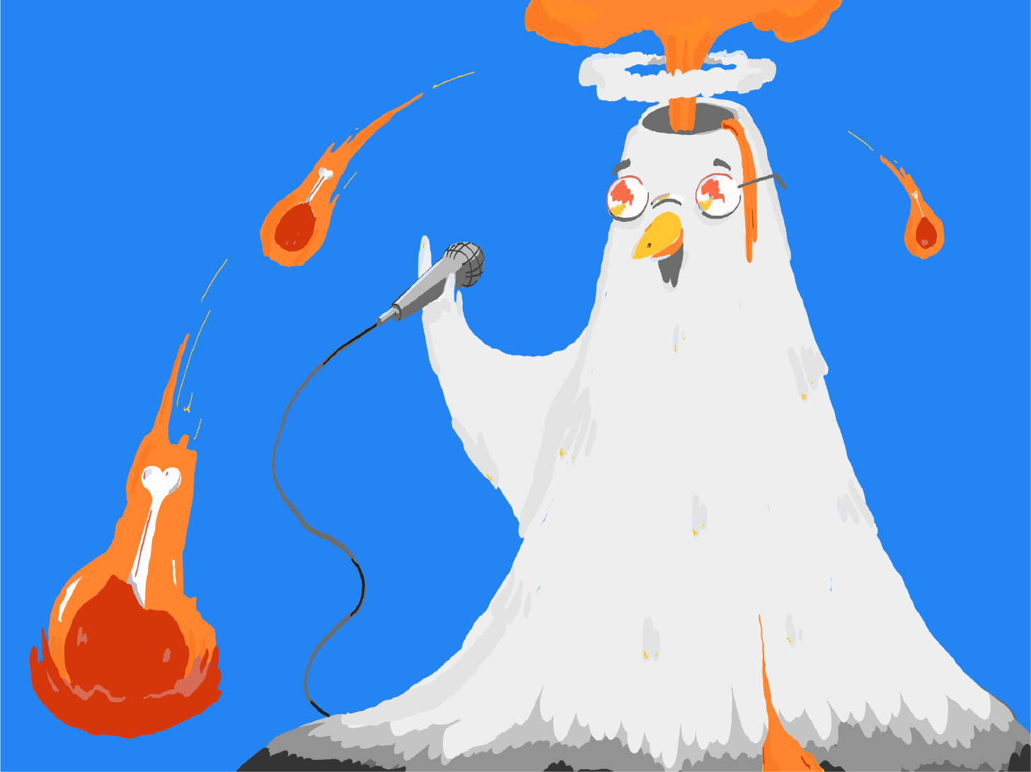
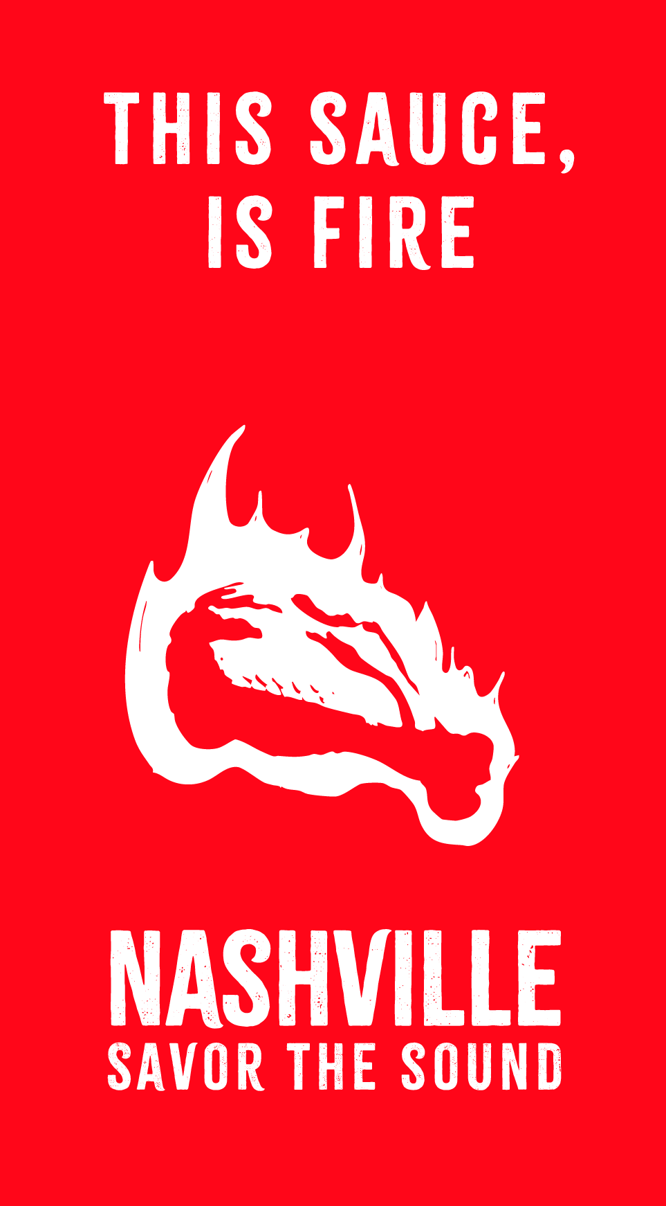
The campaign centered on merging Nashville’s culinary heat with its musical energy through a bold, illustration-driven visual language.
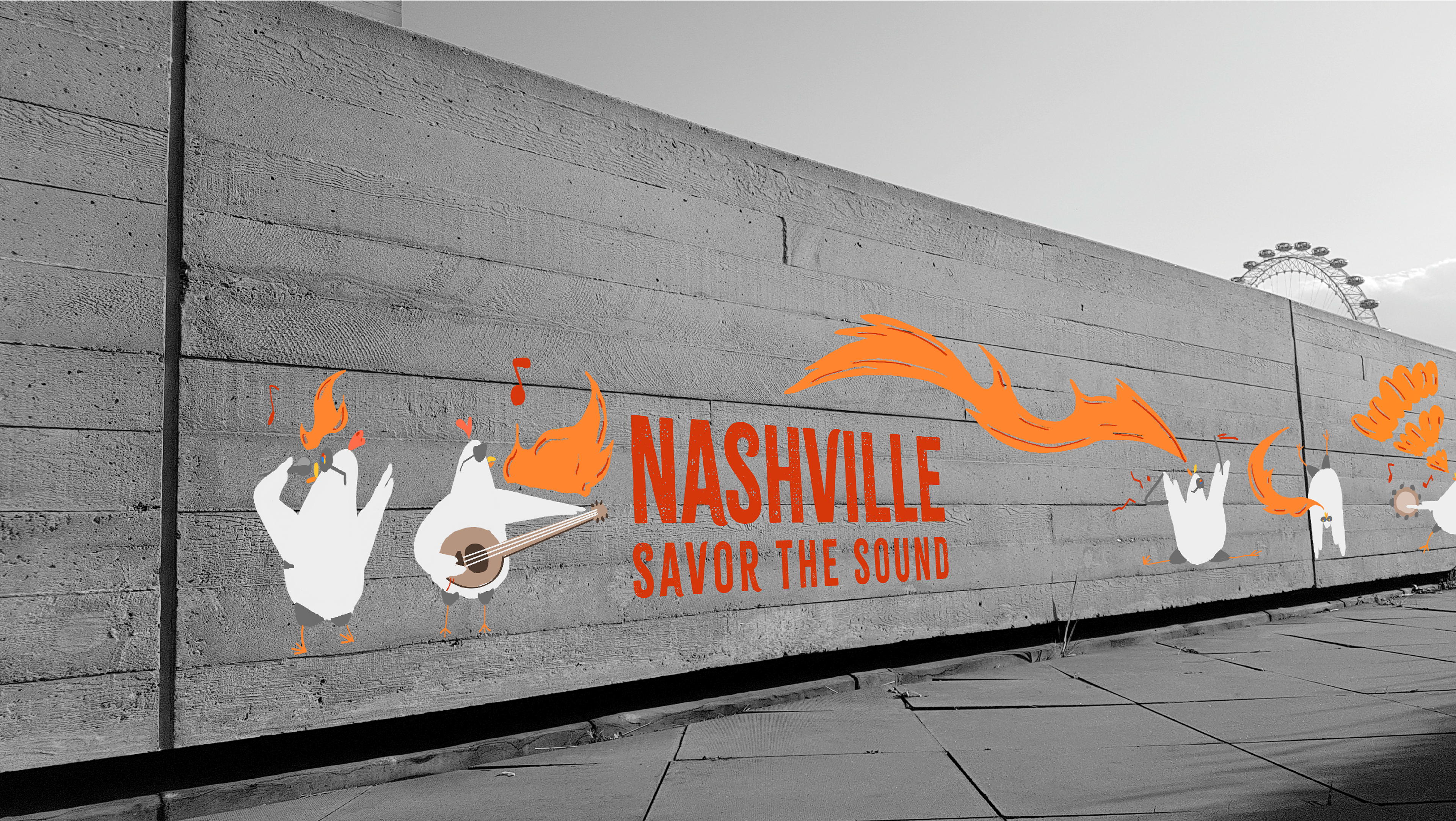
By creating modular illustrated elements and expressive typography, the system was designed to scale from merchandise and packaging to large-format billboards while maintaining strong visual recognition and cohesion.
This approach ensured the concept functioned as a complete advertising system rather than isolated visuals.
SYSTEM / EXECUTION CONTEXT
The final system relied on:
• Consistent color hierarchy to reflect “heat” and movement
• Reusable illustrated components adaptable across formats
• Balanced typography to support both expressive and informational content
Assets were structured to maintain clarity whether applied to food packaging, apparel, print ads, or environmental graphics.
FULL-FUNNEL APPLICATION
The campaign was applied across multiple touchpoints, including:
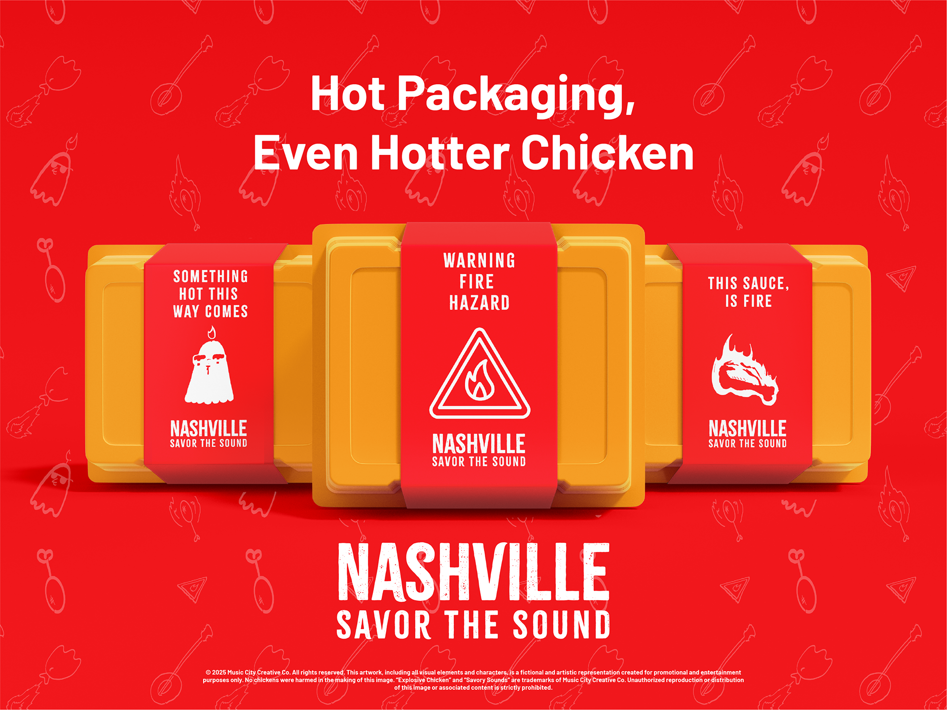
• Food Packaging Concepts
• Sticker Series
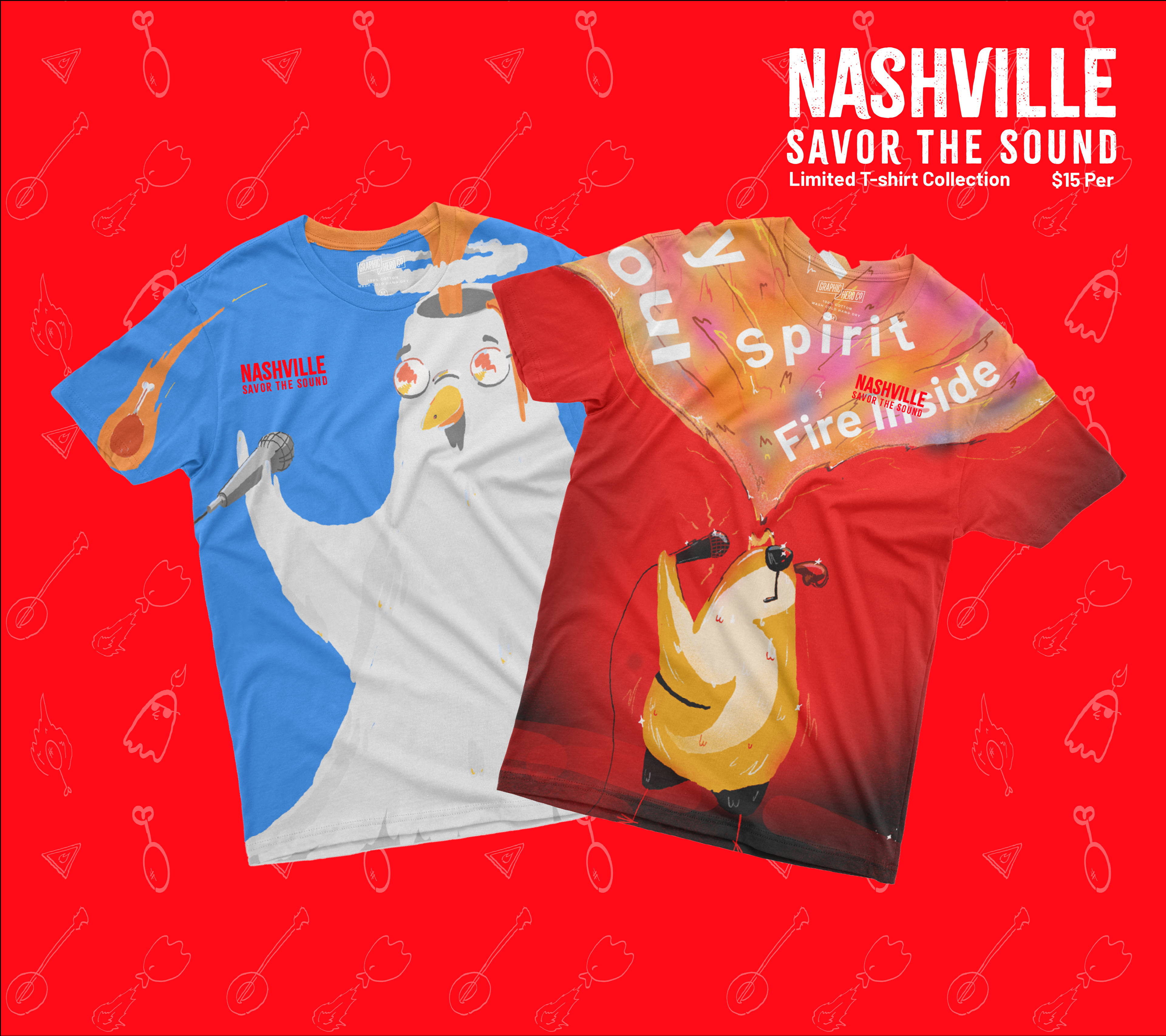
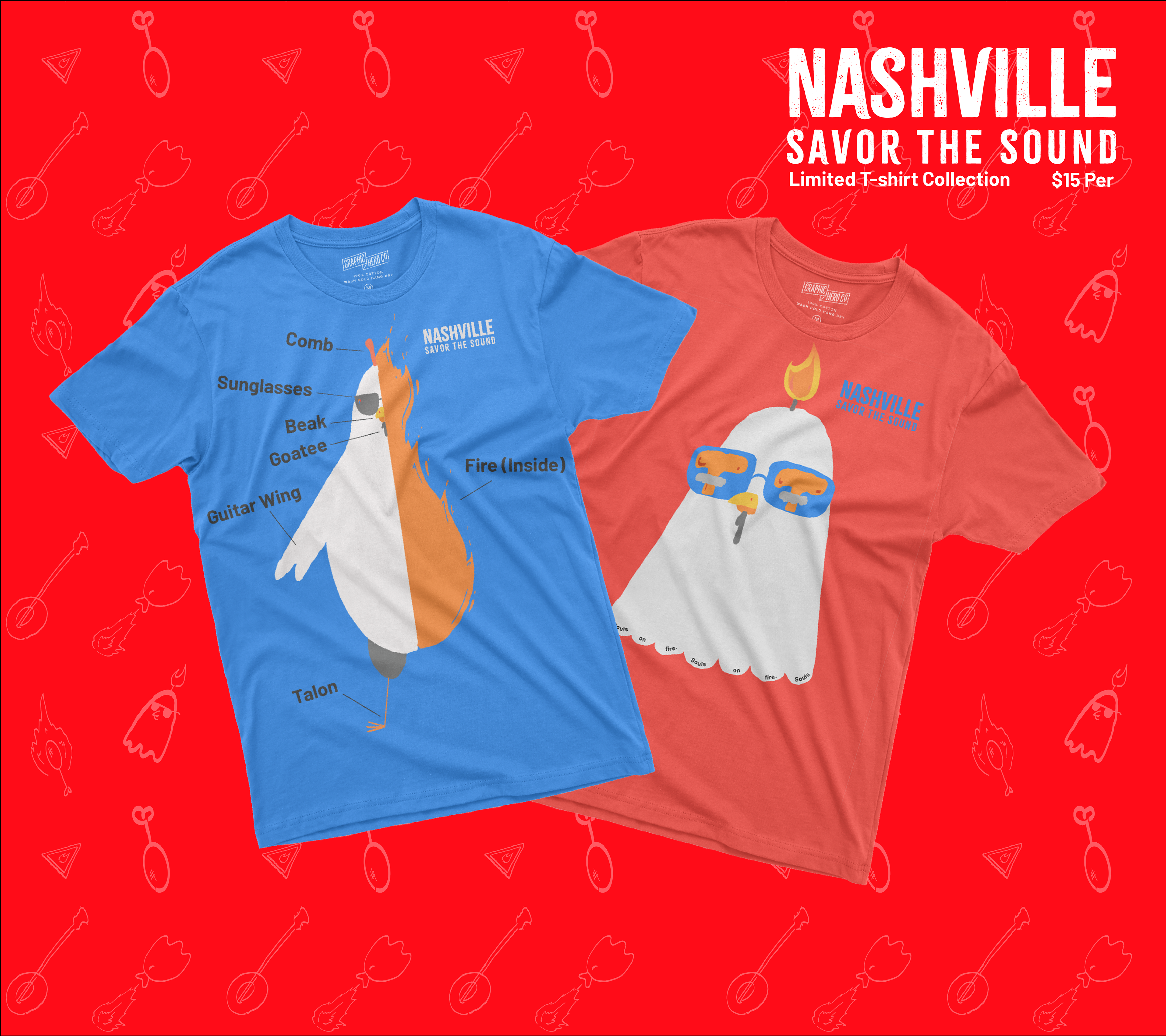
• T-Shirt Illustrations
• Mural Concept
• Billboard Application
• Single Page Print Ad
• Social Media Adaptations
PRODUCTION & REAL-WORLD CONSIDERATIONS
Illustrations were developed as scalable vector assets to maintain clarity across varying print sizes and substrates. Layout systems accounted for readability on curved packaging surfaces, apparel printing, and large-scale outdoor formats.
IMPACT & OUTCOME
This project demonstrates the ability to develop a concept-driven campaign from initial strategy through multi-format execution. It highlights strengths in illustration, system-building, and translating expressive visuals into commercially adaptable applications across packaging, apparel, print, and outdoor advertising.