
Rockford Restaurant Rebrand
Self-Initiated Brand Study — Rockford, MI
This self-initiated rebrand explores how a local Rockford restaurant’s identity could be elevated by integrating its cultural roots with strong community symbolism tied to the Rockford Rams.
Self-Initiated Brand Study — Rockford, MI
This self-initiated rebrand explores how a local Rockford restaurant’s identity could be elevated by integrating its cultural roots with strong community symbolism tied to the Rockford Rams.
BRIEF SNAPSHOT
Project Type:
Personal Brand Study
Personal Brand Study
Objective:
Reimagine an existing local restaurant’s visual identity to create a stronger, more distinctive brand presence rooted in both cultural authenticity and local community recognition.
Reimagine an existing local restaurant’s visual identity to create a stronger, more distinctive brand presence rooted in both cultural authenticity and local community recognition.
Audience:
Rockford residents, local families, and high school–affiliated community members connected to the Rockford Rams identity.
Rockford residents, local families, and high school–affiliated community members connected to the Rockford Rams identity.
Constraints:
• Maintain cultural authenticity while avoiding generic visual tropes
• Integrate local symbolism in a respectful, cohesive way
• Develop scalable assets adaptable across print, packaging, and outdoor formats
• Preserve recognizability for existing customers
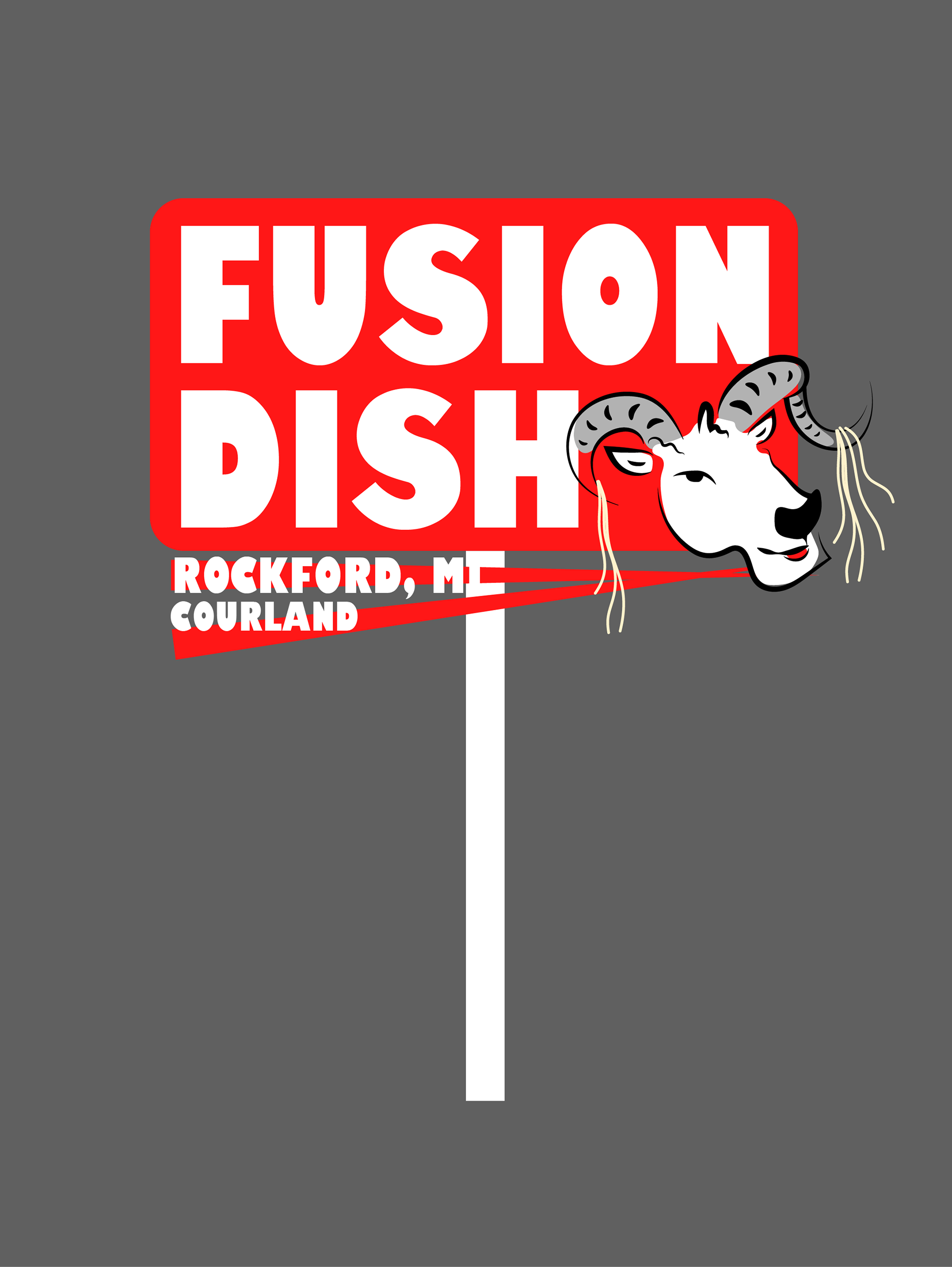
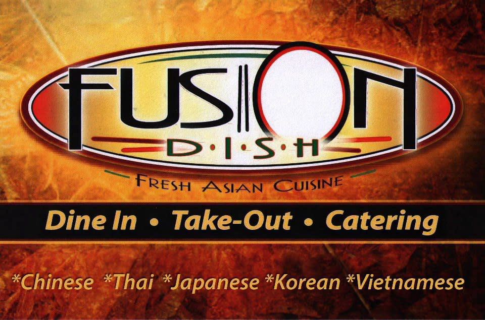
Before
After

MY ROLE & OWNERSHIP
I was responsible for:
I was responsible for:
• Conducting independent research and competitive analysis.
• Developing multiple logo sketches and visual explorations.
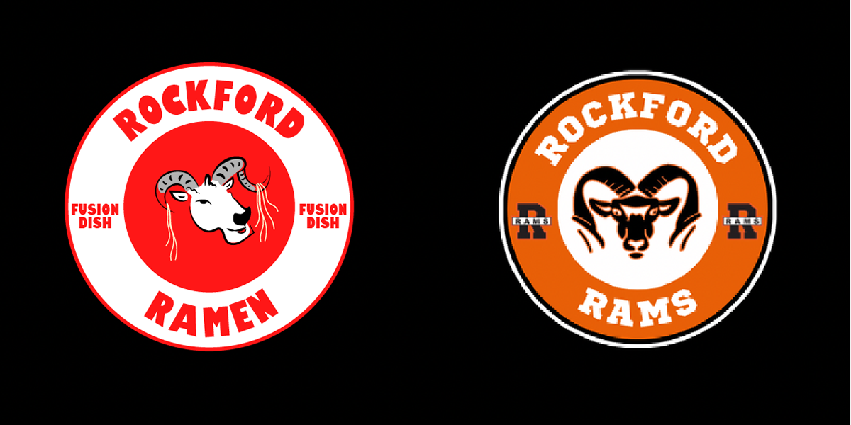
• Refining a final mark blending Ram symbolism with Asian-inspired illustration influences.
• Building a complete brand identity system.
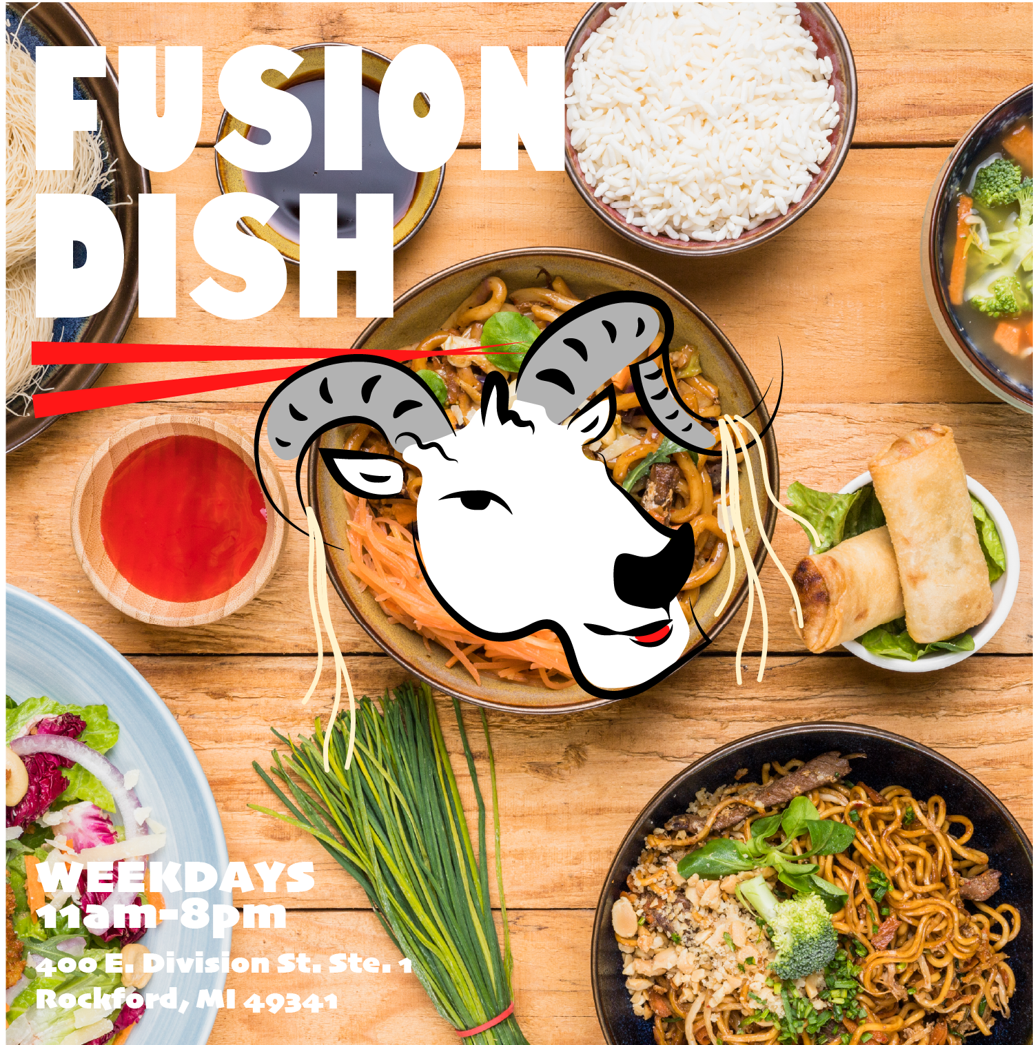
• Applying the identity across menus, packaging, vehicle graphics, OOH, and social ads.
STRATEGIC THINKING
Early concepts felt visually generic and lacked connection to the local context. The direction pivoted toward community integration, drawing inspiration from the Rockford Rams mascot while incorporating stylistic influence from Chinese zodiac illustrations of the ram/sheep.
This approach created a culturally informed yet locally resonant identity, strengthening differentiation while anchoring the brand in its immediate community.
SYSTEM / EXECUTION CONTEXT
The final identity system balances bold iconography with structured typography and adaptable layout systems.
Logo variations were designed to function across sponsorship materials, storefront signage, menus, packaging, and vehicle graphics while maintaining clarity and recognizability at multiple scales.
FULL-FUNNEL APPLICATION
The rebrand was extended across multiple touchpoints, including:
• Primary Logo (Before / After)
• Local Sponsorship Logo Variation
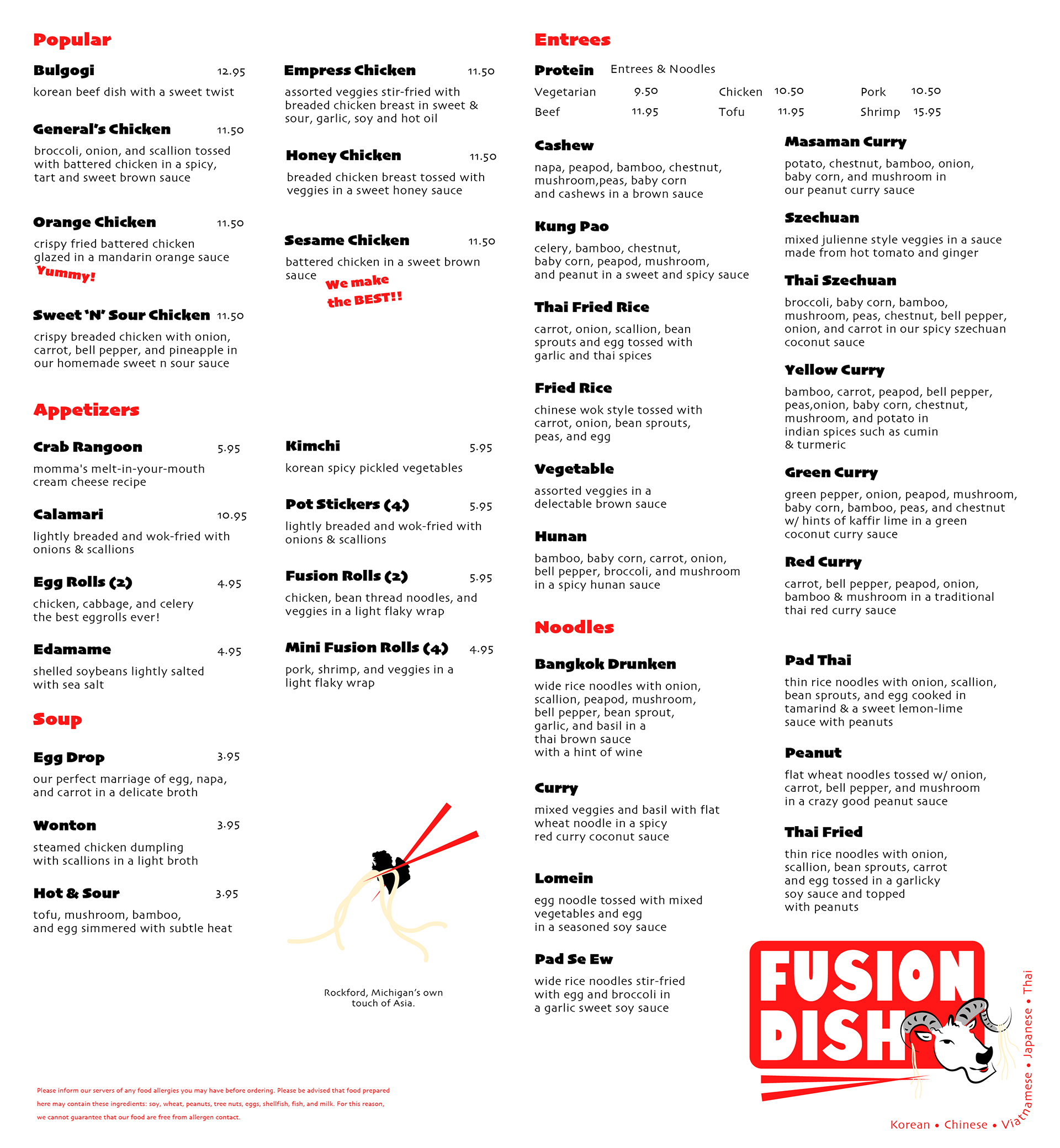
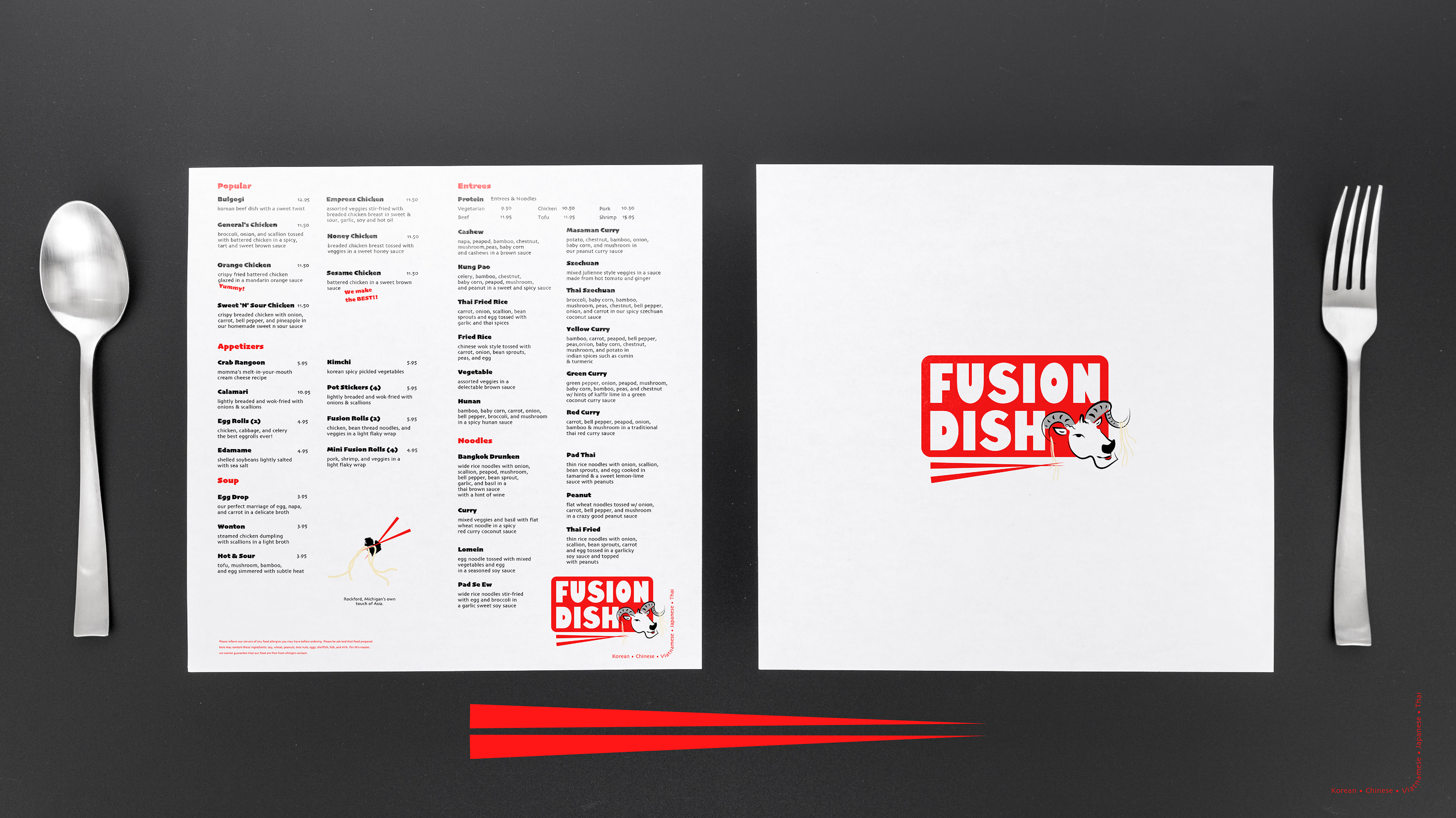
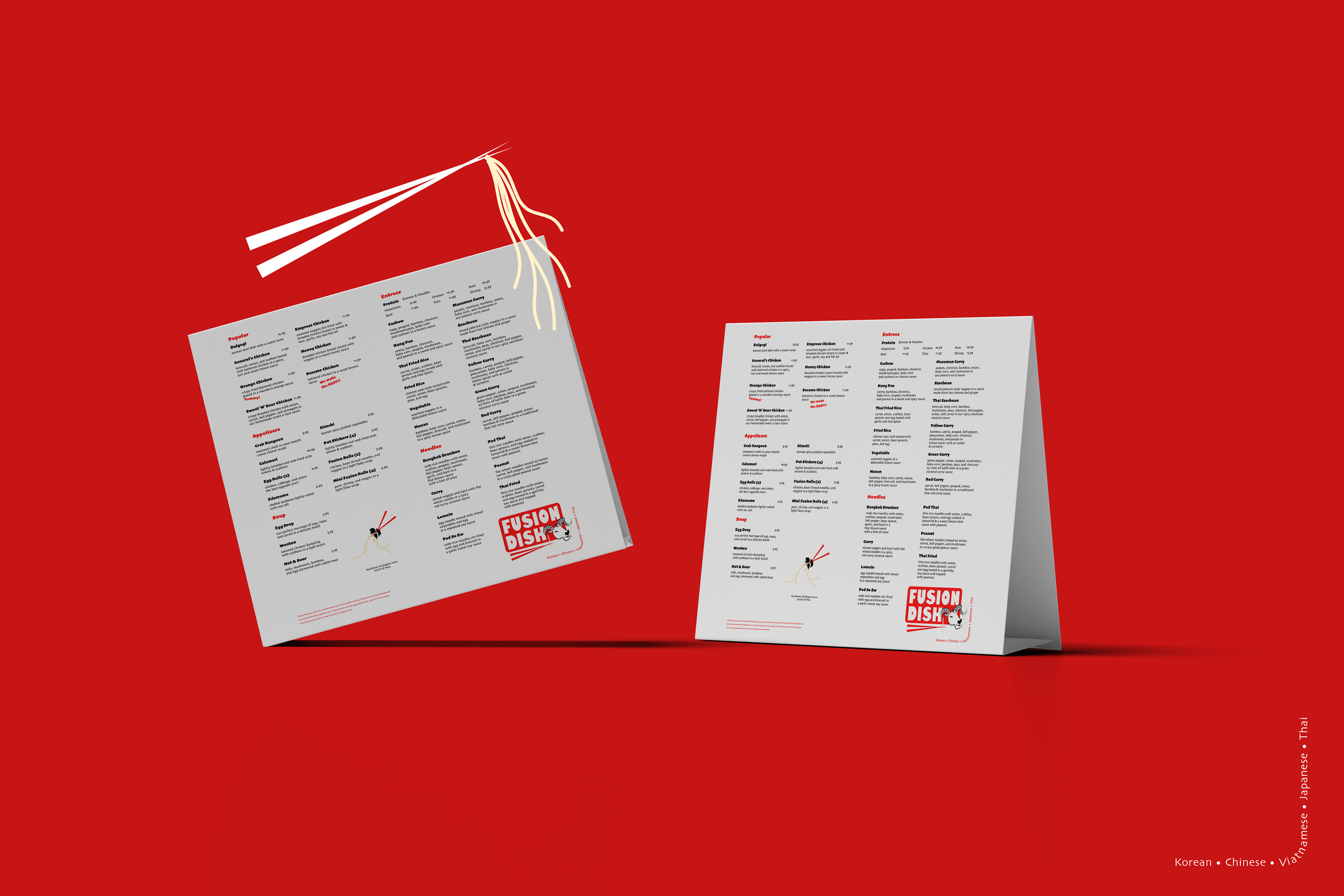
• Menu Design
• Food Packaging System
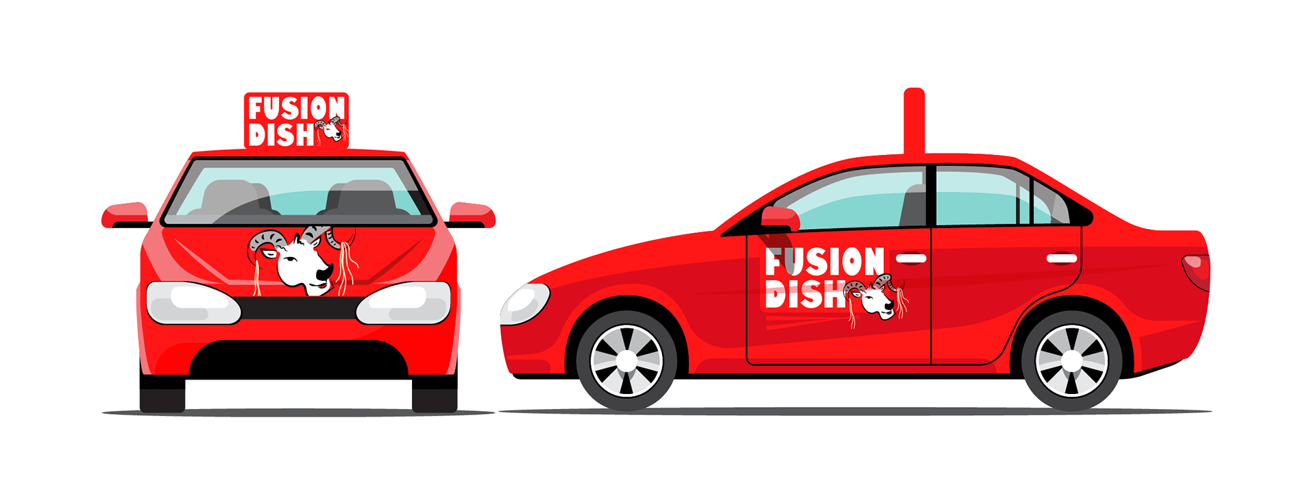
• Vehicle Graphics
• Billboard / OOH Application
• Social Media Ads
PRODUCTION & REAL-WORLD CONSIDERATIONS
The logo system was developed with scalability in mind, ensuring consistent reproduction across print, signage, apparel, packaging, and large-format outdoor placements.

IMPACT & OUTCOME
This project demonstrates the ability to initiate and execute a comprehensive brand study independently, translating research and community insight into a cohesive, multi-touchpoint identity system. It highlights strengths in logo development, cultural integration, and extending a brand consistently across diverse real-world applications.