
Aperitivo Rebrand
Kendall College of Art & Design — Aperitivo, Downtown Market (Grand Rapids, MI)
This self-initiated rebrand reimagines Aperitivo’s visual identity to create a more contemporary, energetic brand presence across packaging, digital, and environmental touchpoints.
Kendall College of Art & Design — Aperitivo, Downtown Market (Grand Rapids, MI)
This self-initiated rebrand reimagines Aperitivo’s visual identity to create a more contemporary, energetic brand presence across packaging, digital, and environmental touchpoints.
BRIEF SNAPSHOT
Project Type:
Personal Brand Refresh Study
Personal Brand Refresh Study
Objective:
Modernize Aperitivo’s existing identity by developing a more distinctive and visually engaging brand system aligned with its premium charcuterie offerings.
Modernize Aperitivo’s existing identity by developing a more distinctive and visually engaging brand system aligned with its premium charcuterie offerings.

Audience:
Downtown Market visitors, food enthusiasts, and consumers drawn to curated, artisanal products.
Downtown Market visitors, food enthusiasts, and consumers drawn to curated, artisanal products.
Constraints:
• Preserve recognizability while elevating visual impact
• Improve shelf presence within a competitive retail environment
• Develop adaptable assets across packaging, web, and environmental formats
MY ROLE & OWNERSHIP
I was responsible for:
I was responsible for:
• Conducting independent brand and competitive research.
• Developing multiple logo iterations and identity explorations.
• Building a cohesive brand system (typography, color palette, illustration).
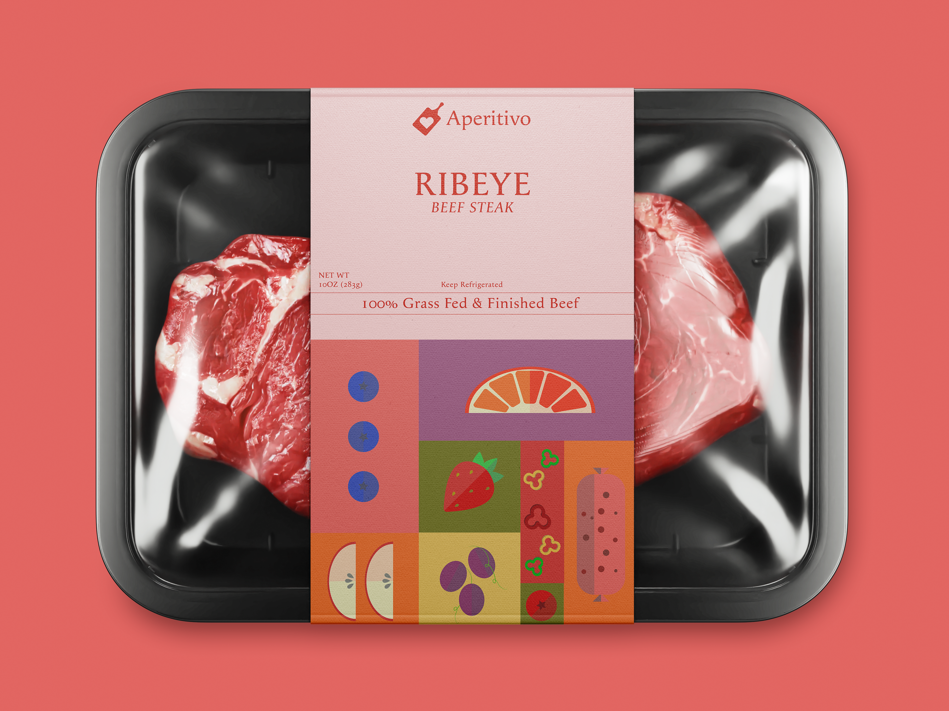
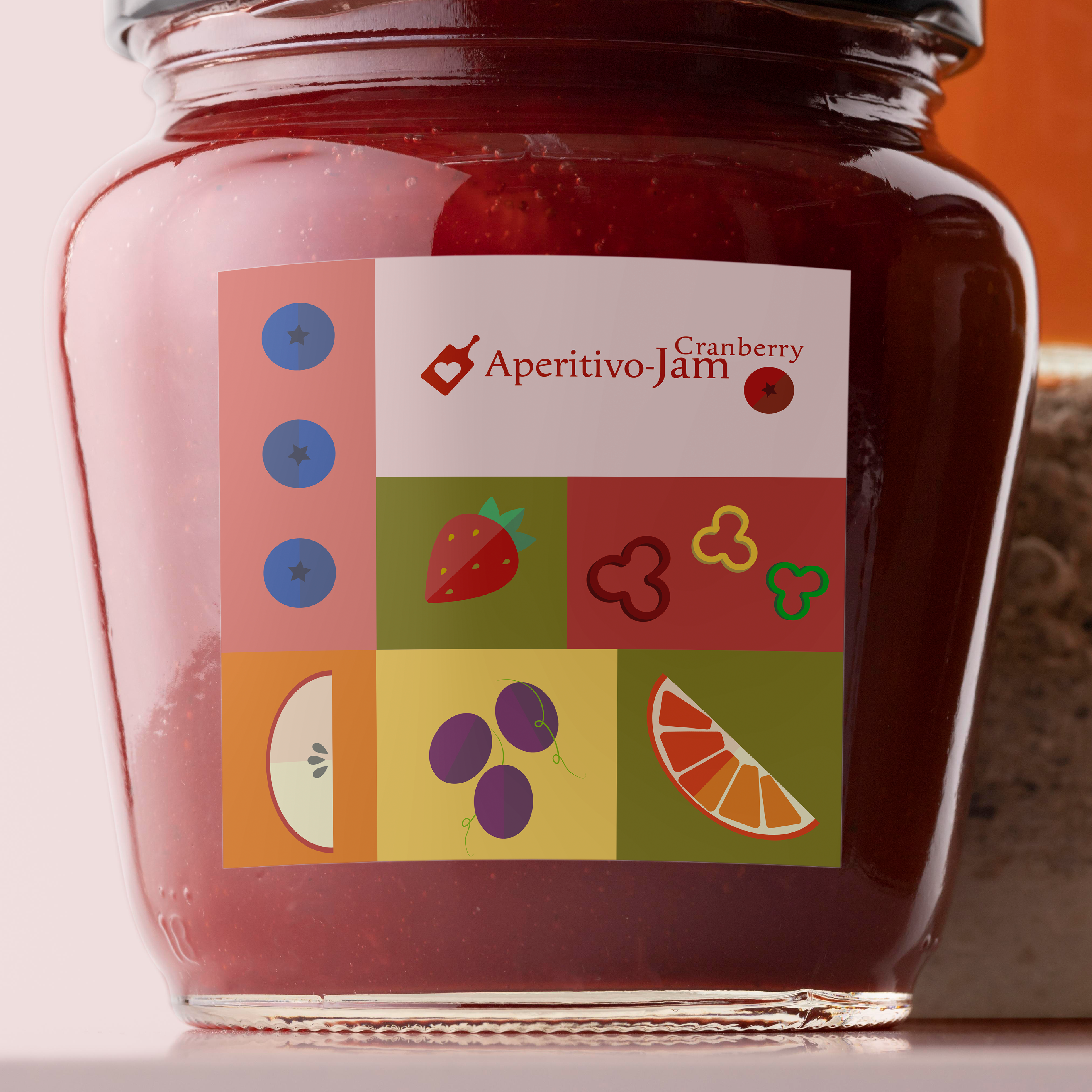
• Designing food packaging concepts optimized for retail visibility.
• Creating a Figma-based web prototype.
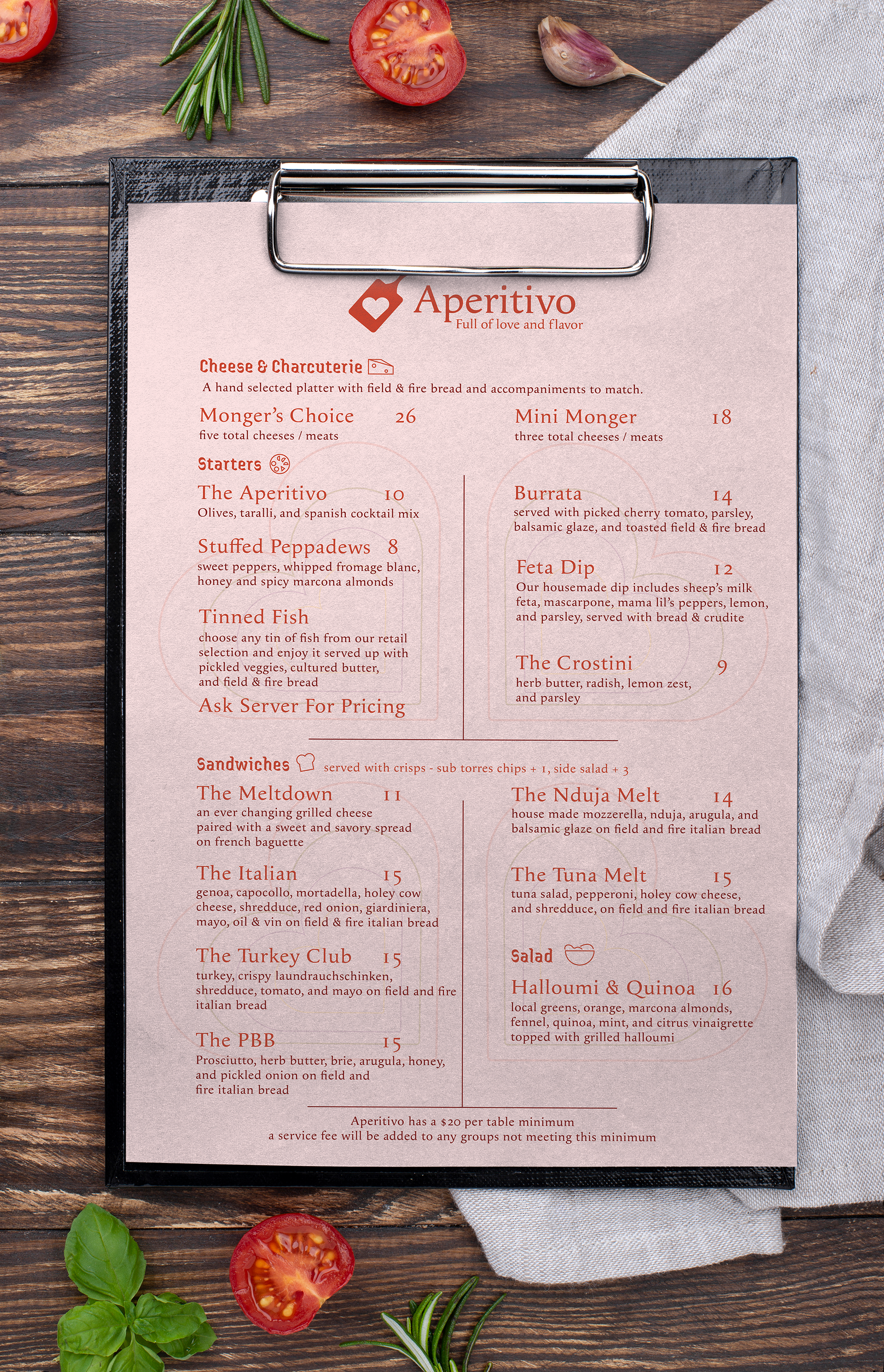
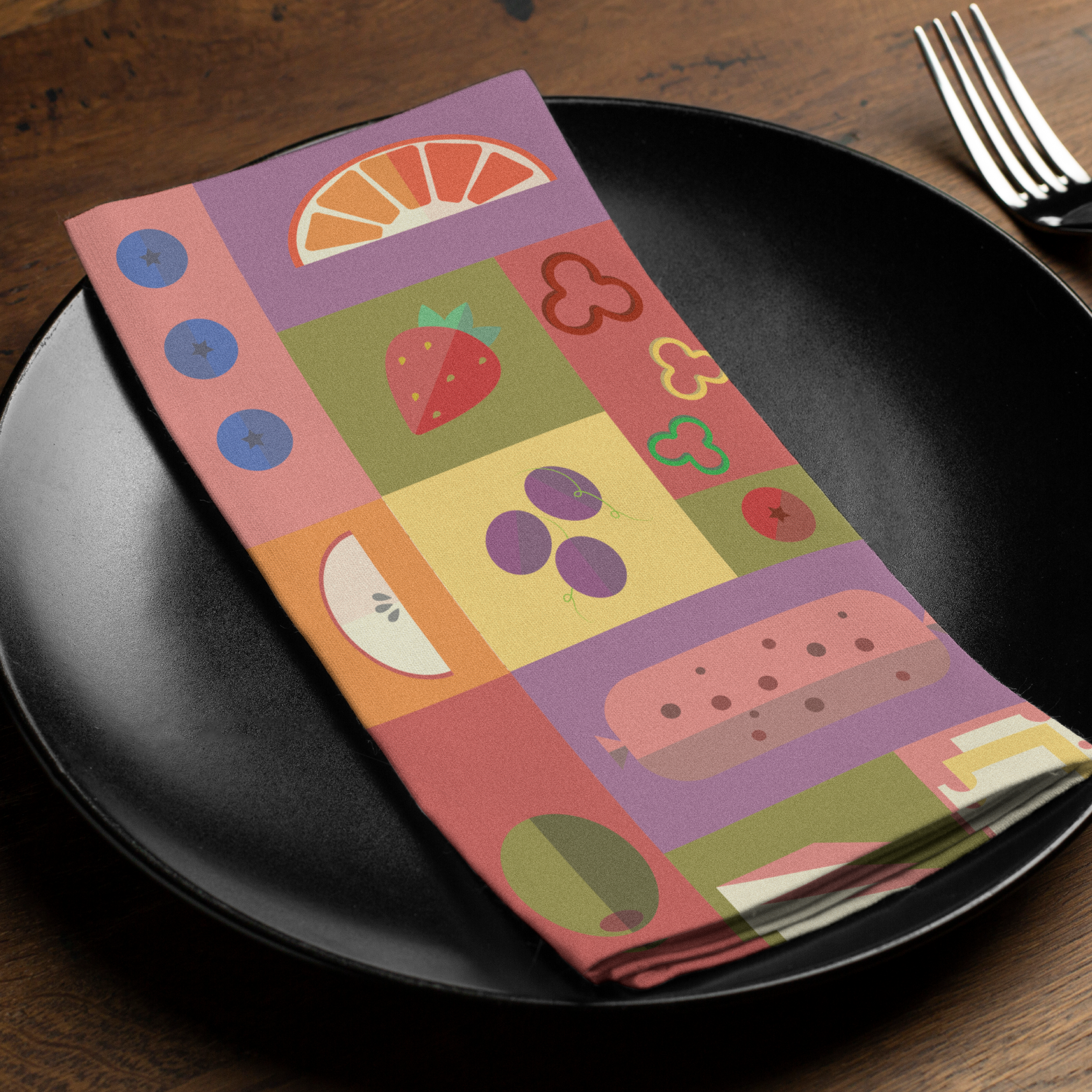
• Developing environmental branding, stationery, and OOH applications.
• Producing a logo animation to extend the brand into motion.
STRATEGIC THINKING
The rebrand focused on increasing shelf visibility and visual distinction while maintaining the elevated tone expected of a specialty food brand.
Rather than relying on traditional rustic aesthetics common in charcuterie branding, the system introduces bolder color contrast, refined typography, and structured layouts to create stronger presence in a retail environment.
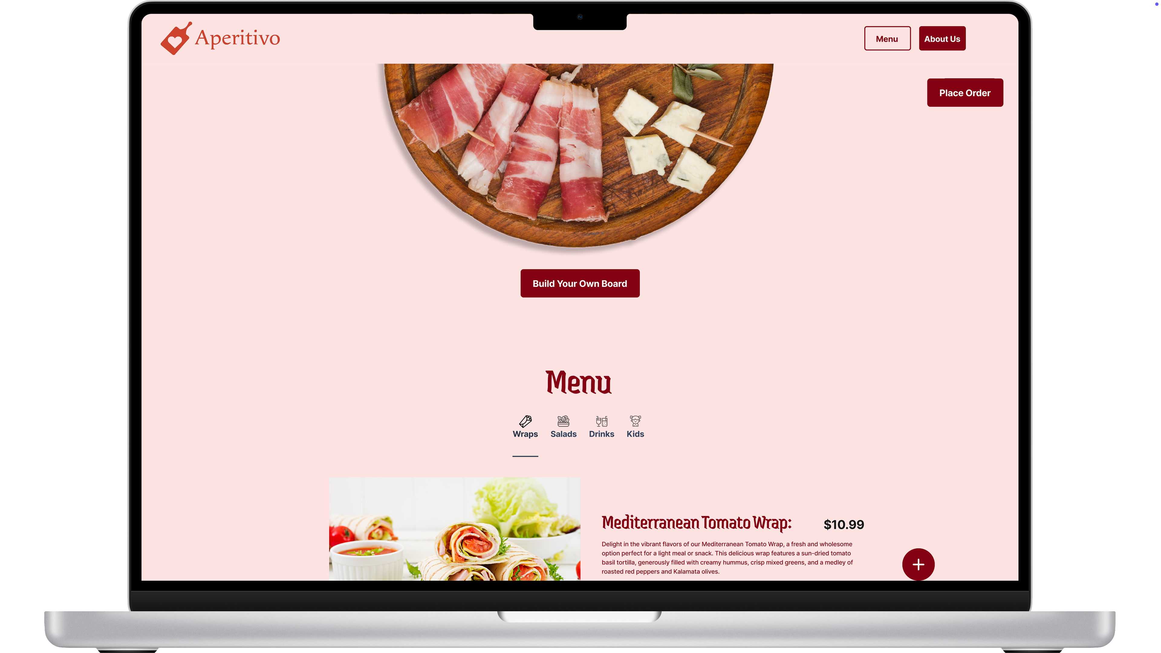
The identity was designed to function cohesively across packaging, web, and environmental applications without losing clarity or premium positioning.
SYSTEM / EXECUTION CONTEXT
The final brand system integrates:
• A refined logo mark adaptable across print and digital environments
• A vibrant yet controlled color palette for improved shelf recognition
• Structured layout systems for packaging and marketing materials
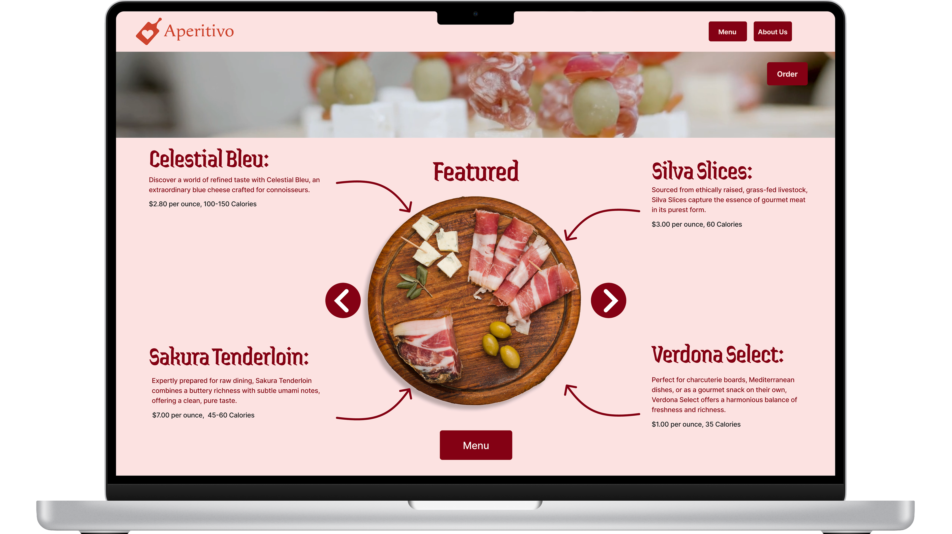
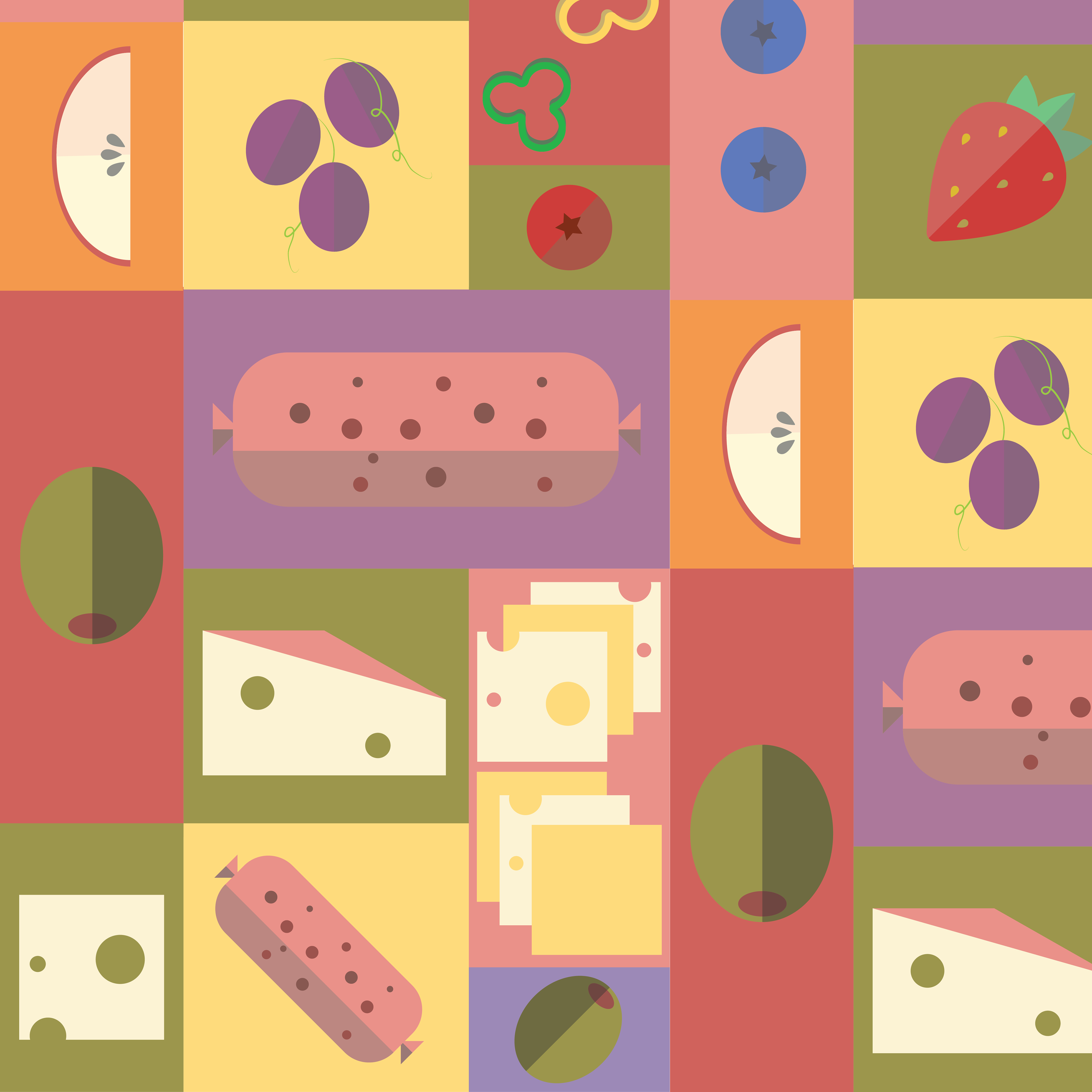
• Illustration elements that add personality without overwhelming product clarity
Assets were designed to scale across physical packaging, web interfaces, and large-format placements.
FULL-FUNNEL APPLICATION
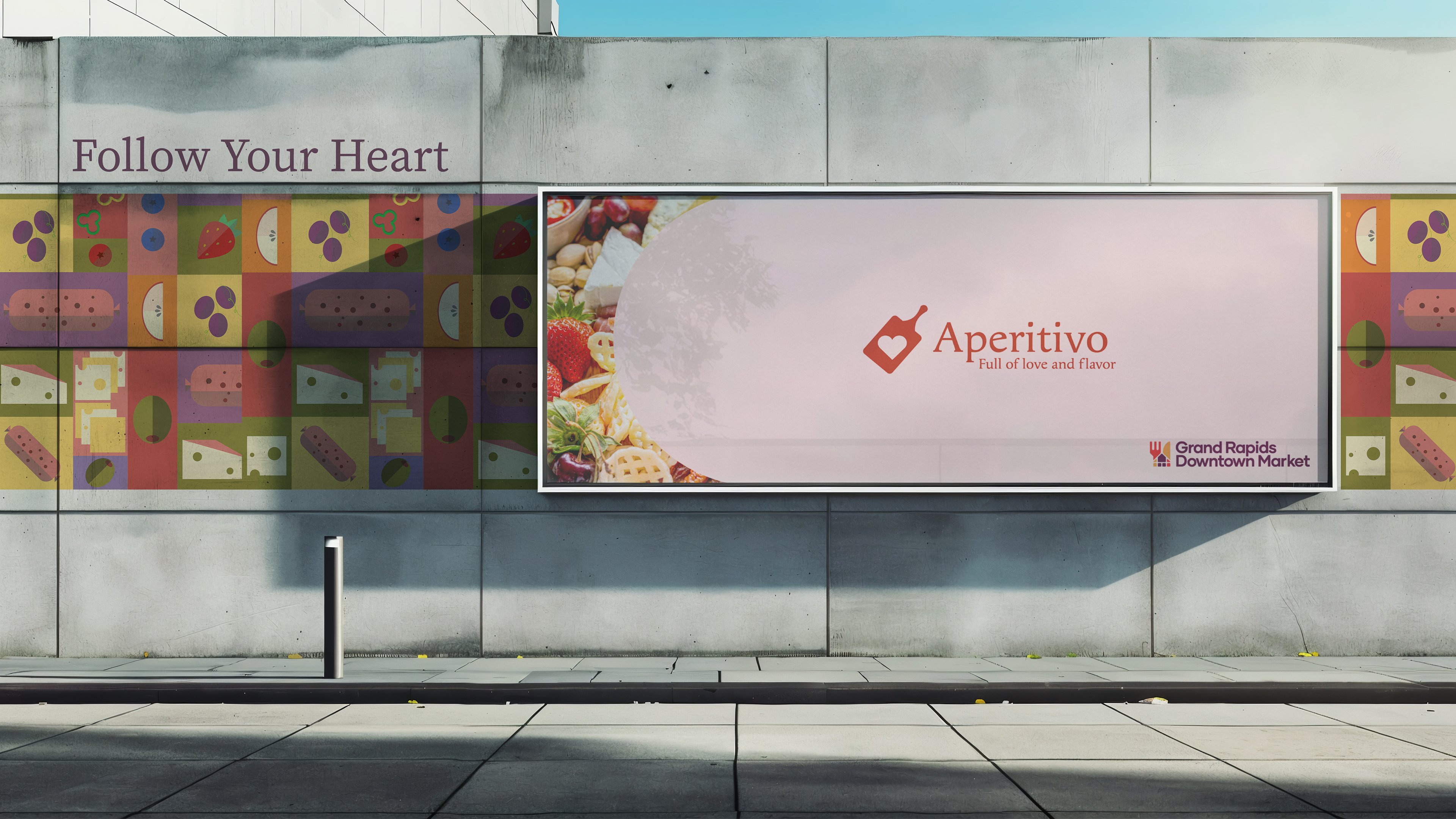
The rebrand was extended across multiple touchpoints, including:
• Primary Logo & Iterations
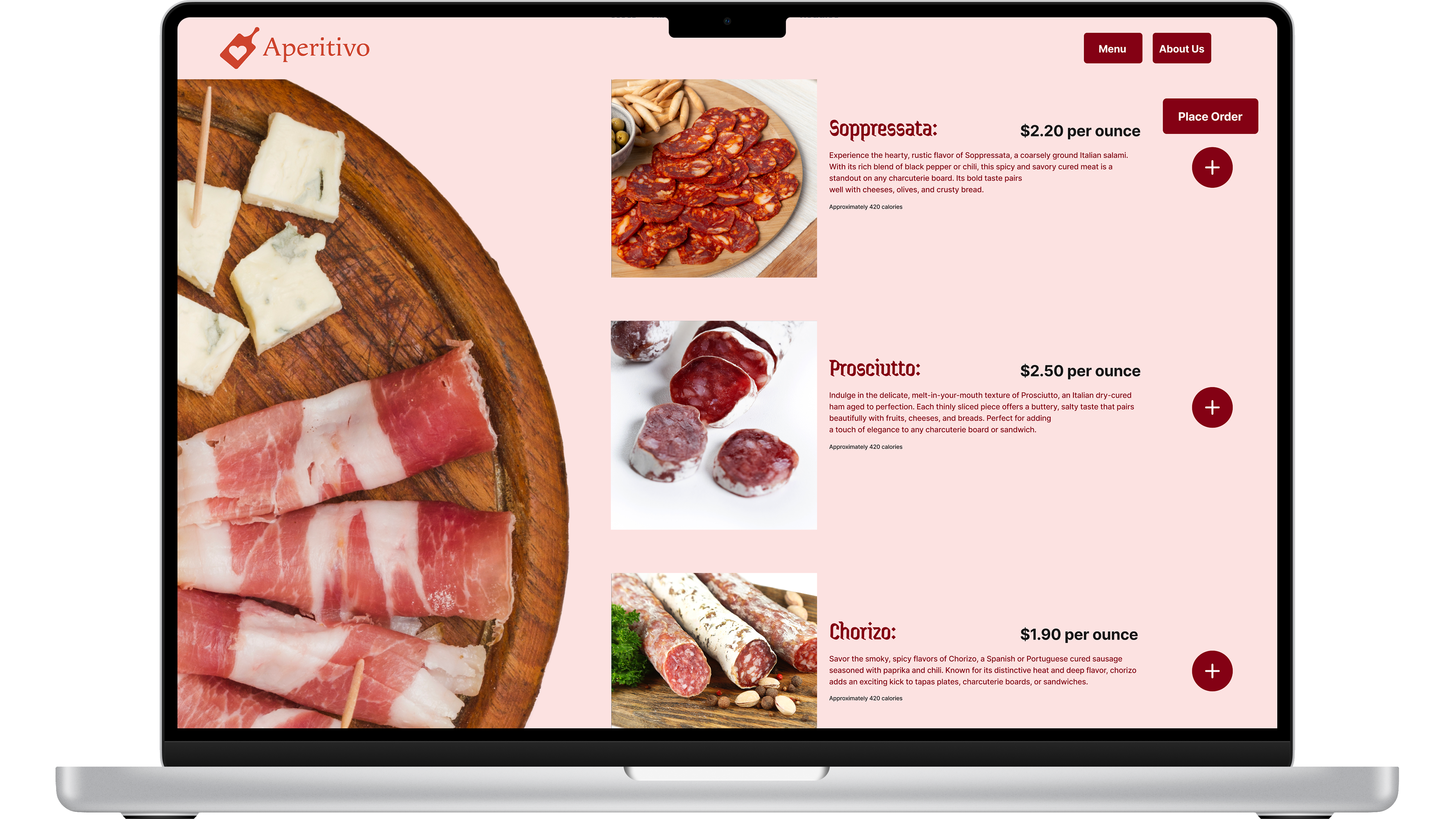
• Web Prototype (Figma)
• Food Packaging System
• Restaurant Stationery & Environmental Decor
• Billboard Concept
• Illustration Assets
• Logo Animation
PRODUCTION & REAL-WORLD CONSIDERATIONS
Packaging layouts were structured for retail shelf visibility and legibility at distance. Web prototypes were designed with realistic UI hierarchy and responsive structure in mind. Logo animation maintained clarity and simplicity to ensure adaptability across digital platforms.
IMPACT & OUTCOME
This project demonstrates the ability to independently evaluate and evolve an existing brand into a more contemporary, scalable identity system. It highlights strengths in iteration, packaging design, digital prototyping, and extending a cohesive visual language across physical and digital environments.